Preview image. Unlock full-res
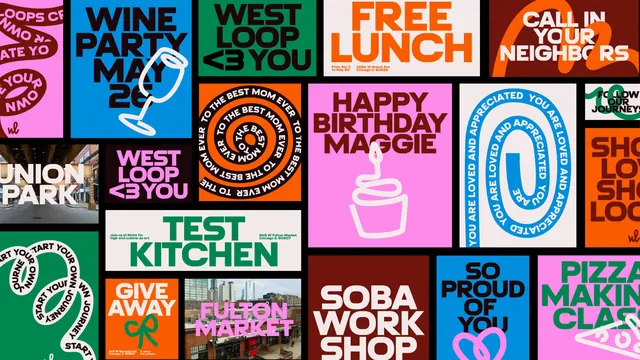
A dense tiled wall of West Loop posters showing the full range of the system, from typographic slogans to line drawings to photographic tiles.
More like this
See all
Summary
A single frame packed edge to edge with around twenty poster tiles in mixed proportions, presented as one wall so the breadth of the system reads at a glance.
Visual description
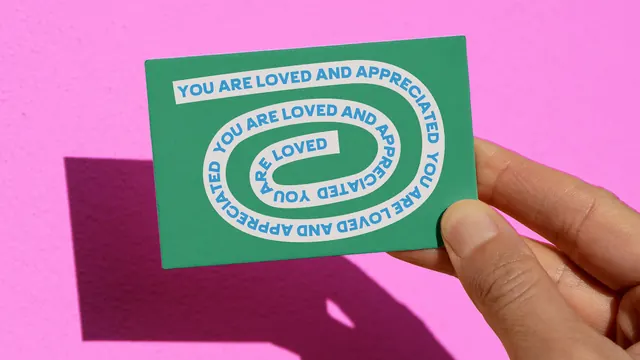
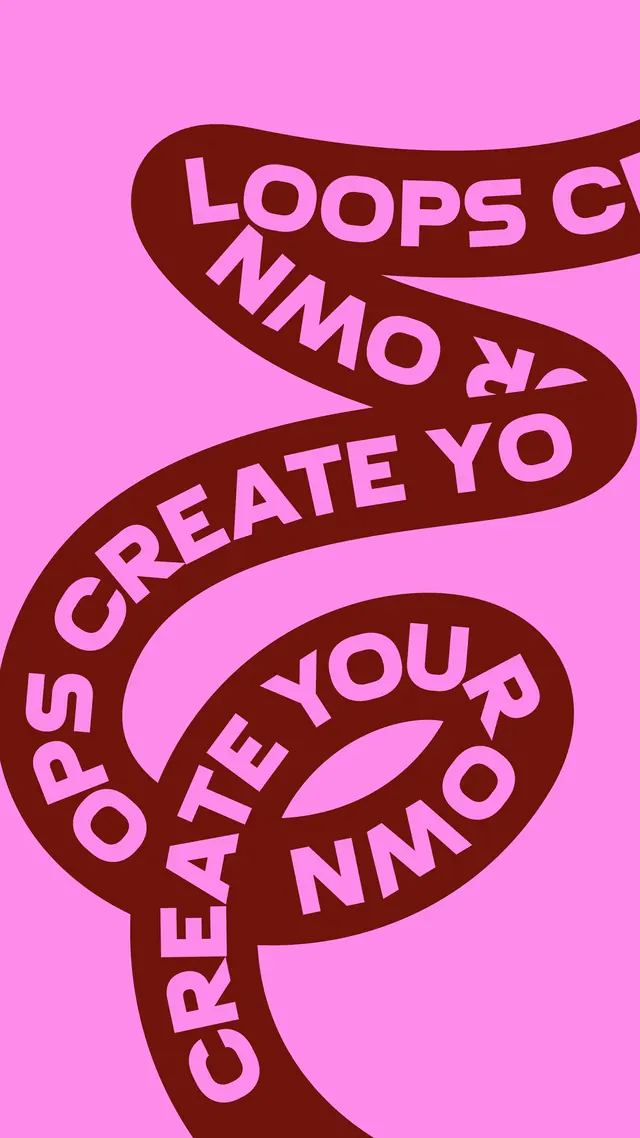
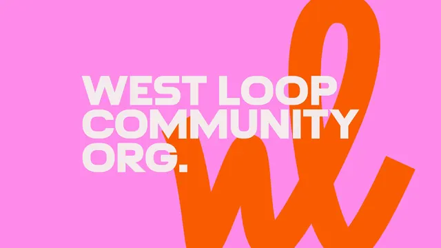
Tiles butt directly against each other with no gutters, cropped by all four edges so the wall appears to continue. The palette cycles through bubblegum pink, deep maroon, bright orange, kelly green, cobalt blue, off-white and near-black, with almost every tile using just two of those. Content varies by type: flat headline tiles ("WINE PARTY MAY 26", "FREE LUNCH", "HAPPY BIRTHDAY MAGGIE", "SOBA WORK SHOP", "SO PROUD OF YOU", "TEST KITCHEN", "PIZZA MAKING CLASS", "WEST LOOP <3 YOU" twice in different colourways); type-on-a-path tiles where a phrase spirals inward ("TO THE BEST MOM EVER", "YOU ARE LOVED AND APPRECIATED") or snakes along a ribbon ("START YOUR OWN JOURNEY", "CREATE YOUR OWN LOOPS"); tiles combining a headline with a white single-stroke drawing of a wine glass, a cupcake, a bow or a pizza slice; and two photographic tiles showing a street under an elevated track labelled "UNION PARK" and a market building labelled "FULTON MARKET". A few carry small date, address or venue lines in the corner, and the "wl" monogram appears in several bottom corners.
Key takeaway
Showing a system as an uninterrupted wall rather than a neat grid of framed examples proves the rules hold at any crop. The consistency comes from three constants only, one condensed all-caps face, a fixed six-colour palette and one drawing style, which leaves the layouts free to differ wildly.
Reuse notes
The best single reference in this project for how a place or community brand scales to dozens of small, occasional, low-budget messages. Use it as a model for a template library where local organisers fill in their own copy. As a presentation device, the seamless wall is excellent for a case study hero, though individual tiles are too small here to read as final artwork.