Preview image. Unlock full-res
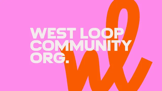
The West Loop Community Org. wordmark in cream all-caps set across a bubblegum pink field with an oversized orange script loop mark behind it.
More like this
See all
Summary
A flat brand slide holding the wordmark against a hot pink ground, with the script monogram blown up to several times the type size and cropped by the frame.
Visual description
The field is a saturated bubblegum pink filling the whole canvas. Left of centre the wordmark is set in three left-aligned lines, "WEST LOOP / COMMUNITY / ORG.", in a heavy condensed grotesque, all caps, in a warm off-white close to cream. The letterspacing is tight and the lines are set solid so the block reads as a rectangle. Behind and to the right sits an orange lowercase "wl" script monogram at enormous scale, drawn as one continuous rounded stroke: the "w" starts below the type block, the loop of the "l" rises past the top edge and the tail exits the right edge. Both the top and bottom of the monogram are cut off by the canvas, so only its middle is visible. The cream type sits fully in front of the orange, and there is no other element, rule or texture in the frame.
Key takeaway
Two colours and two type weights, with the whole hierarchy created by scale difference alone. Cropping the script mark so it runs off three edges turns a logo into a background pattern without adding any new asset.
Reuse notes
A dependable formula for cover slides, social tiles and title cards in a community or place brand. The pink and orange pairing is deliberately loud and needs a cream rather than pure white to stop it vibrating. If the mark is set any smaller the composition loses its tension, so treat the crop as intentional rather than a safe-area error.