Preview image. Unlock full-res
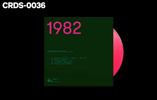
Album cover for Crianza Records featuring a bold vinyl record design with year "1982" in bright magenta type against deep green background.
Summary
Album cover for Crianza Records (1982) featuring a bold magenta vinyl record on a deep green background with large typography announcing the year.
Visual description
Album sleeve showing a full-color vinyl record in bright pink/magenta positioned on the right edge of a deep forest green cover. Large sans-serif numerals "1982" dominate the center in the same bright magenta. Below the year sits a framed tracklist in smaller green text listing five songs. A small Crianza Records logo and label details appear at the bottom left. The composition is minimalist and high-contrast, with the pink vinyl and text standing out sharply against the dark background.
Key takeaway
The power of duotone color restriction and bold large-scale typography to create memorable album artwork. The floating vinyl on the cover edge creates visual interest and immediately signals the music/record format.
Reuse notes
Effective for music labels and record releases seeking a bold, contemporary aesthetic. The high contrast and simple color palette ensure the design reads well at small scale on physical product. Works well for vinyl packaging where the disc itself becomes a design element.