Preview image. Unlock full-res
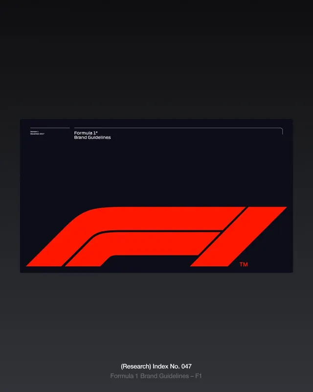
A presentation slide of the 2017 Formula 1 brand guidelines cover, the speed-streaked red F1 mark filling the lower half of a near-black panel.
Summary
A case-study slide showing the cover of Formula 1's December 2017 brand guidelines: the bright red F1 logomark, where negative space between an "F" and the speed lines forms the "1", spans the bottom of a dark rounded panel.
Visual description
The slide floats a wide, dark navy-black panel with softly rounded corners on a subtly graded charcoal background. The panel's upper-left corner carries small white metadata, "Version 1 / December 2017" and "Formula 1 Brand Guidelines", set in a clean condensed sans, with a thin rounded line tracing inward from the top-right corner. The lower half is owned by the F1 wordmark in vivid red: bold tapered forms whose internal white gap reads as the numeral 1, the whole mark angled to imply motion and clipped by the panel edge with a small red "TM" at its base. Below the panel, faint grey captions read "(Research) Index No. 047" and "Formula 1 Brand Guidelines, F1".
Key takeaway
The logo using pure negative space, the unmarked gap, to spell the "1" rather than drawing it. Cropping the mark so it bleeds off the panel edge implies speed and scale better than centering it would. Tucking version and date as small corner metadata keeps a cover authoritative without clutter.
Reuse notes
A reference for guideline covers and logo-reveal slides where a single mark must carry the page. The red-on-near-black duotone reads as fast, premium, and broadcast-ready; suits sport, automotive, and high-energy tech brands. Needs a logomark strong enough to stand alone at this size.
More like this





Keep what you find
A free account saves references to boards and can send you a weekly email of picks based on what you save.
To see every result, go Pro.