Preview image. Unlock full-res
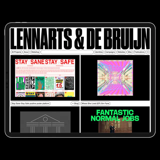
A portfolio website interface for design studio Lennartis & de Bruijn, featuring their work grid with filterable project categories and diverse creative disciplines.
Summary
A portfolio website for design studio Lennartis & de Bruijn showcasing a curated grid of their diverse creative work across design disciplines, with categorical filtering navigation.
Visual description
The portfolio website displays the studio name "Lennartis & de Bruijn" in bold, all-caps white sans-serif type at the top, framed by a thick white border. Below is a navigation bar with filter buttons: All Projects, About, Workshop, Identities, Campaigns, Websites, Misc, Publications. The main content area shows a 2x2 grid of featured projects, each with distinct visual character: a red and white "Stay Sane Stay Safe" poster platform, a vibrant neon-pink abstract composition, an architectural line drawing, and a photograph with bright green typography overlay ("Fantastic Normal Jobs"). Heavy black borders separate each project cell against a white background.
Key takeaway
The stark geometric frame and filter-based navigation system allows a multidisciplinary portfolio to feel coherent—every project category (posters, abstract graphics, architectural design, photography) reads as part of one cohesive studio output.
Reuse notes
Effective for design studios or agencies with diverse project types. The 2x2 grid and thick borders create impact with limited information density. The color-blocked project layouts contrast effectively with the black-and-white frame structure. Works well when projects have strong visual distinctiveness from one another.
More like this



Keep what you find
A free account saves references to boards and can send you a weekly email of picks based on what you save.
To see every result, go Pro.