Preview image. Unlock full-res
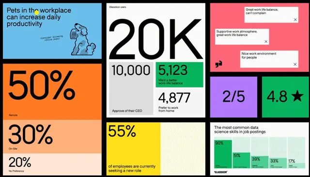
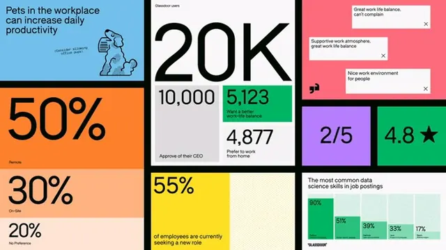
A bento-grid infographic using eight color-blocked panels to present Glassdoor workforce statistics including KPI numbers, a vertical bar chart, and employee review quotes.
Summary
A bento-grid infographic using eight color-blocked panels to present Glassdoor workforce statistics: KPI callouts, a vertical bar chart of data-science skills, and employee review quote cards.
Visual description
Eight panels arranged in a three-column bento grid, each a solid block of color carrying one data story. Top-left: sky-blue panel with a headline claim about pet productivity and a halftone dog illustration. Bottom-left: orange and salmon panels stacked vertically, displaying "50%", "30%", and "20%" in oversized black sans-serif with remote/on-site/no-preference labels below. Center: white panel dominated by an enormous "20K" KPI in black, with stacked sub-stats below (10,000 / 5,123 green-highlighted / 4,877) referencing CEO approval and work-life balance. Bottom-center: yellow panel with "55%" in oversized type and a dotted texture pattern beside it. Right column, top: pink panel showing three employee review quote cards with close-quote icons and dismiss Xs. Right-center: purple panel with a "2/5" rating and green panel with "4.8 star" rating in bold. Bottom-right: off-white panel with a titled vertical bar chart showing five bars (Python 90%, a domain-specific language 51%, Hadoop 39%, Java 33%, Spark 17%) labeled "The most common data science skills in job postings" with a "GLASSDOOR" attribution.
Key takeaway
The bento-grid approach lets radically different chart types (bar chart, KPI block, quote card, rating) coexist at the same visual weight through panel color alone. The oversized-number-as-hero technique turns each panel into a poster within the grid. The green highlight on one sub-stat inside the center panel creates hierarchy without additional chart furniture.
Reuse notes
Strong reference for HR dashboards, company-report landing pages, or editorial data sections where multiple KPI types need equal prominence. The color-per-panel logic works best with five or more distinct metrics. Requires a confident, opinionated color palette; muted palettes lose the panel separation.
More like this
Keep what you find
A free account saves references to boards and can send you a weekly email of picks based on what you save.
To see every result, go Pro.