Preview image. Unlock full-res
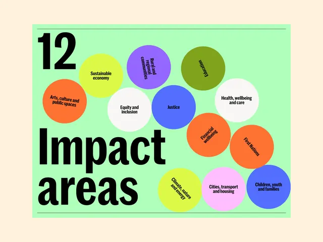
This infographic uses a clean, modern, and organized approach to categorize impact areas using a vibrant yet harmonious color palette.
Summary
This infographic uses a clean, modern, and organized approach to categorize impact areas using a vibrant yet harmonious color palette.
Visual description
This infographic uses a clean, modern, and organized approach to categorize impact areas using a vibrant yet harmonious color palette. The design relies heavily on circular nodes against a light green background, creating a sense of clarity and accessibility for complex information. The layout is a radial or clustered arrangement where various circular nodes are distributed across the frame, emphasizing equal importance for each category. Bold, sans-serif typeface is used for the main title ('Impact areas') and a large number ('12'), suggesting a contemporary and strong visual hierarchy.
Key takeaway
An infographic reference. Worth saving for its infographic, modern, flat design treatment.
Reuse notes
Fits general design work.
More like this
Keep what you find
A free account saves references to boards and can send you a weekly email of picks based on what you save.
To see every result, go Pro.