Preview image. Unlock full-res
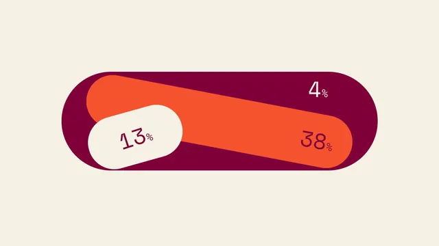
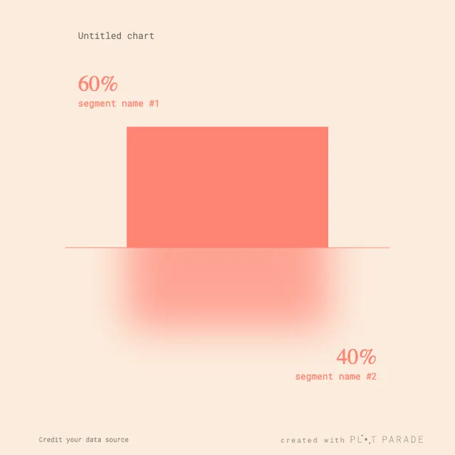
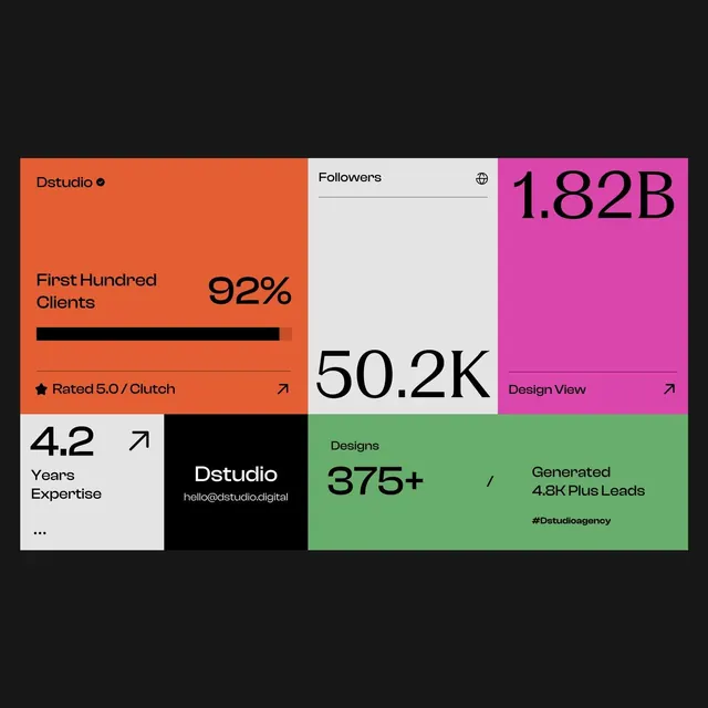
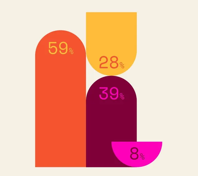
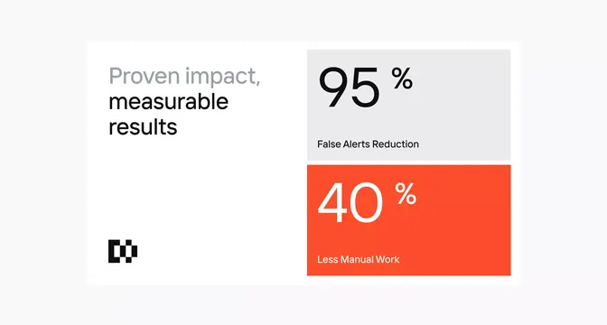
This is a minimalist data visualization using horizontal bars of varying lengths and colors to represent percentages.
Summary
This is a minimalist data visualization using horizontal bars of varying lengths and colors to represent percentages.
Visual description
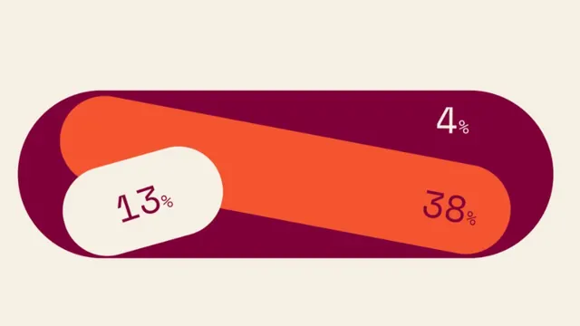
This is a minimalist data visualization using horizontal bars of varying lengths and colors to represent percentages. The design relies on strong color contrast between the deep purple background and the bright orange fill to draw attention to the data points. The composition is horizontal, featuring three distinct colored bars arranged linearly against a muted background. Simple sans-serif font is used for the percentage labels, appearing clean and legible.
Key takeaway
A data viz reference. Worth saving for its minimalist, data visualization, flat design treatment.
Reuse notes
Fits analytics work.