Preview image. Unlock full-res
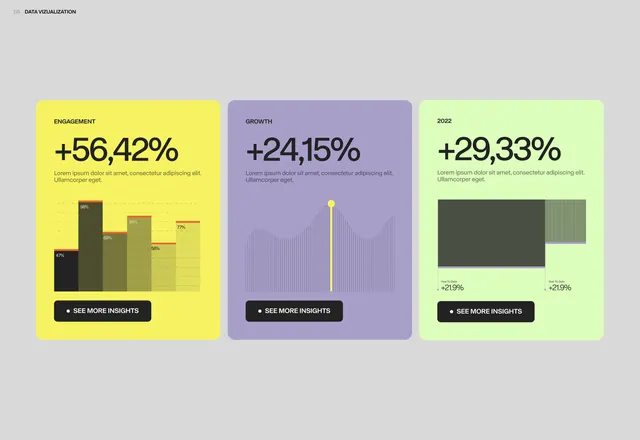
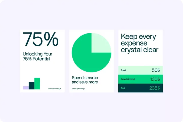
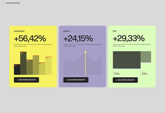
A modern data visualization dashboard featuring three metric cards with bold percentage increases displayed prominently.
Summary
A modern data visualization dashboard featuring three metric cards with bold percentage increases displayed prominently.
Visual description
A modern data visualization dashboard featuring three metric cards with bold percentage increases displayed prominently. The design uses a vibrant, contrasting color palette with clean typography and minimalist chart graphics to communicate key performance indicators in an accessible, contemporary style. Three vertically-stacked cards arranged horizontally in a grid, each with consistent internal hierarchy of metric, subtitle, visualization, and call-to-action button. Bold, sans-serif typeface for percentage values; smaller sans-serif for labels and descriptive text; high contrast for readability.
Key takeaway
An infographic reference. Worth saving for its data visualization, dashboard, minimalist treatment.
Reuse notes
Fits analytics, fintech work.
More like this
Keep what you find
A free account saves references to boards and can send you a weekly email of picks based on what you save.
To see every result, go Pro.