Preview image. Unlock full-res
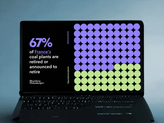
The image presents a data visualization on a laptop screen, using a grid of colored circles to represent statistics about coal plants.
Summary
The image presents a data visualization on a laptop screen, using a grid of colored circles to represent statistics about coal plants.
Visual description
The image presents a data visualization on a laptop screen, using a grid of colored circles to represent statistics about coal plants. The design is clean, modern, and uses a distinct color contrast between purple and lime green to highlight the data. The composition is dominated by a large, organized grid structure filling the central area of the screen. Clear, sans-serif typeface is used for the percentage and text labels.
Key takeaway
An infographic reference. Worth saving for its data visualization, minimalist, infographic treatment.
Reuse notes
Fits general design work.
More like this



Keep what you find
A free account saves references to boards and can send you a weekly email of picks based on what you save.
To see every result, go Pro.