Preview image. Unlock full-res
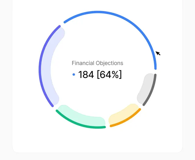
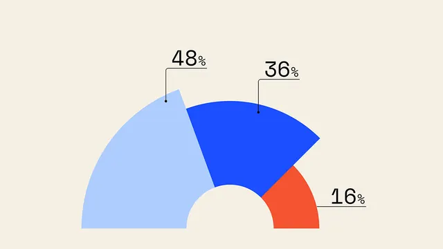
This is a clean and modern data visualization using a donut chart style to represent a proportion of financial objections.
Summary
This is a clean and modern data visualization using a donut chart style to represent a proportion of financial objections.
Visual description
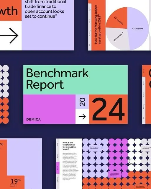
This is a clean and modern data visualization using a donut chart style to represent a proportion of financial objections. The design is highly functional, utilizing distinct colors and clear labeling to make the data immediately understandable and accessible. The composition is structured circularly, using segmented arcs to visually distribute and compare various data categories. Simple sans-serif font is used for labels and numerical data, prioritizing readability.
Key takeaway
An infographic reference. Worth saving for its minimalist, data visualization, infographic treatment.
Reuse notes
Fits fintech work.
More like this


Keep what you find
A free account saves references to boards and can send you a weekly email of picks based on what you save.
To see every result, go Pro.