Preview image. Unlock full-res
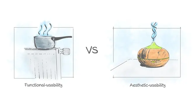
A hand-drawn, watercolor-washed illustration contrasting functional usability with aesthetic usability using two steaming household objects.
Summary
A hand-drawn, watercolor-washed illustration contrasting functional usability with aesthetic usability using two steaming household objects.
Visual description
Two line-art illustrations sit side by side against a white background, each framed in a thin-lined rectangle with a soft blue watercolor wash behind it, separated by a bold "VS". On the left, a saucepan sits on a stovetop with three curls of steam rising, labeled "Functional-usability" beneath. On the right, a rounded ceramic essential-oil diffuser with a green top and a single spiral of steam sits on a table, labeled "Aesthetic-usability" beneath.
Key takeaway
Two visually parallel steam-emitting objects, one purely practical and one purely decorative, make the abstract idea of "functional vs. aesthetic usability" legible at a glance without any body copy.
Reuse notes
Good as a conceptual slide or blog header for UX/product-design writing about usability or design principles. The hand-drawn, watercolor treatment gives it a soft, approachable tone; it would need a redraw to fit a more corporate deck.
More like this

Keep what you find
A free account saves references to boards and can send you a weekly email of picks based on what you save.
To see every result, go Pro.