Preview image. Unlock full-res
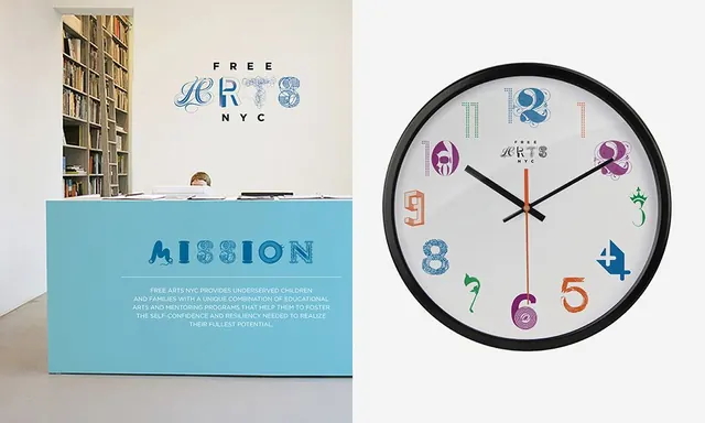
A nonprofit identity for Free Arts NYC that builds its logo and clock face from individually illustrated, mismatched ornamental letterforms and numerals over a sky-blue reception desk.
Summary
A Free Arts NYC identity whose defining move is a logotype assembled from individually illustrated, mismatched ornamental glyphs, then carried onto a wall mark, a sky-blue reception desk, and a wall clock.
Visual description
Two panels side by side. Left: a gallery-like space with a tall bookshelf and a powder-blue reception counter; "FREE ARTS NYC" sits on the back wall in a logo where each letter of "ARTS" is a different decorative, hand-drawn capital, and "MISSION" plus body copy are knocked out of the desk front in the same mixed-letterform style. Right: a black-rimmed wall clock whose numerals 1 through 12 are each a separate ornate, multicolor illustrated figure (teal, purple, green, orange) circling the small centered logo. The palette stays light and airy, anchored by the single saturated blue of the desk.
Key takeaway
The system idea: a logo built from a set of individually styled, mismatched ornamental glyphs, then extended as a kit-of-parts across signage, a desk, and a clock. Each numeral becomes its own small illustration while the whole still reads as one mark.
Reuse notes
Strong reference for arts, education, or community nonprofits that want warmth and craft without looking childish. The mismatched-glyph approach needs a restrained, neutral environment (white walls, one accent color) to keep it from tipping into clutter.
More like this

Keep what you find
A free account saves references to boards and can send you a weekly email of picks based on what you save.
To see every result, go Pro.