Preview image. Unlock full-res
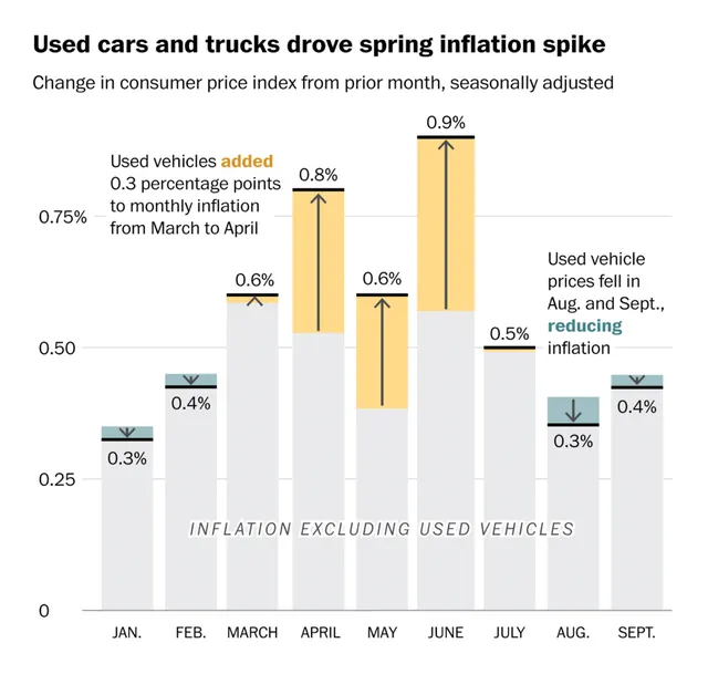
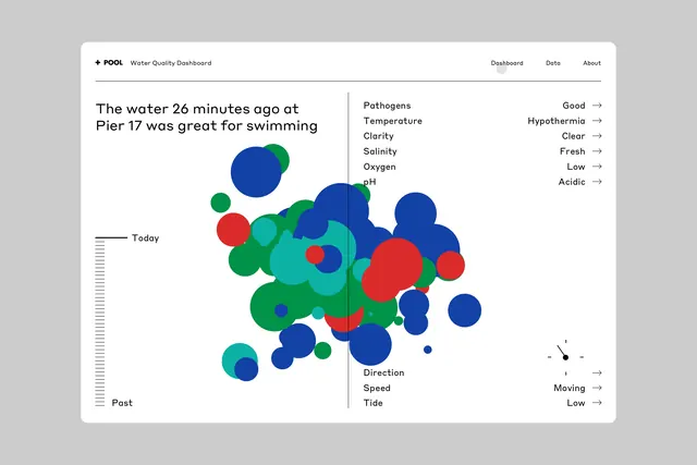
This is a data visualization dashboard presenting water quality metrics using a scatter plot or bubble chart format.
Summary
This is a data visualization dashboard presenting water quality metrics using a scatter plot or bubble chart format.
Visual description
This is a data visualization dashboard presenting water quality metrics using a scatter plot or bubble chart format. The design is clean, functional, and uses color coding effectively to represent different parameters for a specific event (water quality). The layout is dominated by a central scatter plot where data points are distributed across a two-dimensional space, anchored by labeled axes. Sans-serif typeface is used for labels and titles, appearing clean and modern.
Key takeaway
A data viz reference. Worth saving for its data visualization, dashboard, scatter plot treatment.
Reuse notes
Fits general design work.