Preview image. Unlock full-res
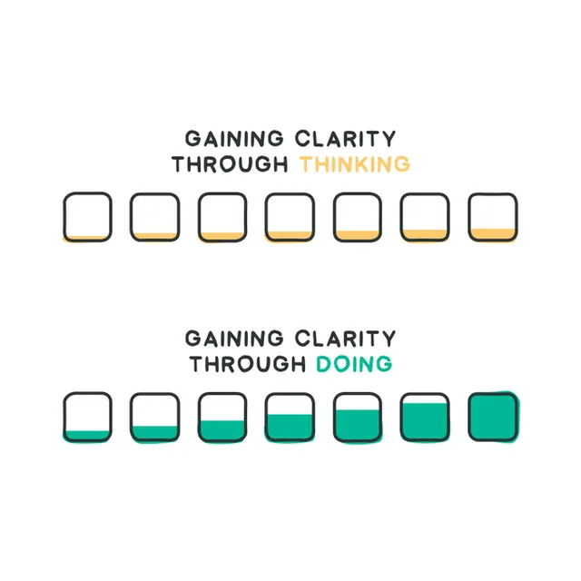
An infographic showing two parallel progress flows using stacked container icons—one filled with yellow/gold, one with teal/green—paired with opposing conceptual messages.
Summary
An infographic using two parallel rows of progress containers to visualize contrasting concepts: "Gaining clarity through thinking" shown with yellow fill progression, and "Gaining clarity through doing" shown with teal fill progression.
Visual description
Two rows of seven rounded-square containers each show progressive fill levels. The top row fills left-to-right with yellow/gold color, paired with all-caps text "GAINING CLARITY THROUGH THINKING" where "THINKING" is in gold. The bottom row fills left-to-right with teal/green, paired with "GAINING CLARITY THROUGH DOING" where "DOING" is in teal. Clean line work and simple color coding make the contrast clear.
Key takeaway
Using visual symmetry (two identical progress patterns) and opposing color schemes (warm vs. cool) to visually represent contrasting abstract concepts without additional illustration.
Reuse notes
Strong reference for process visualization, educational infographics, conceptual diagrams, or comparison illustrations in presentations.
More like this



Keep what you find
A free account saves references to boards and can send you a weekly email of picks based on what you save.
To see every result, go Pro.