Preview image. Unlock full-res
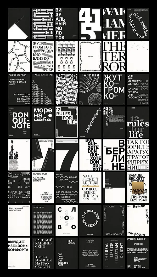
A grid of black-and-white typography poster covers with oversized serif and sans-serif type, mostly in Russian and English.
Summary
A grid of black-and-white typography poster covers with oversized serif and sans-serif type, mostly in Russian and English.
Visual description
The image shows a tightly packed grid of many square book or poster covers arranged edge to edge on a black background. Most covers use stark black, white, and gray with large serif type, stacked sans-serif type, rotated text, and occasional abstract linework or simple shapes.
Key takeaway
Use a strict monochrome system with oversized type as the main visual element, then vary orientation, scale, and alignment to create rhythm across a grid. The repeated square format makes the whole set feel like a coherent series even when each cover is visually distinct.
Reuse notes
Reach for this when you need a strong editorial system for a poster series, publication set, or type-led brand library. It works best when content is text-heavy and you want the typography itself to carry the identity.