Preview image. Unlock full-res
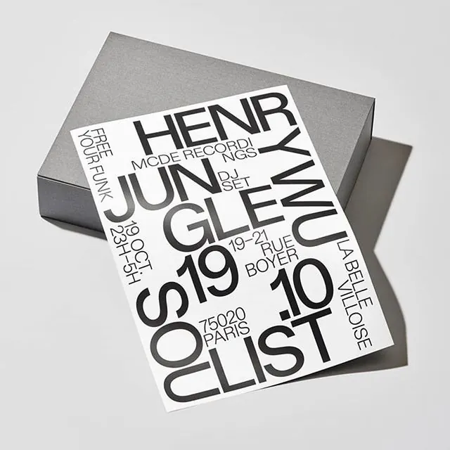
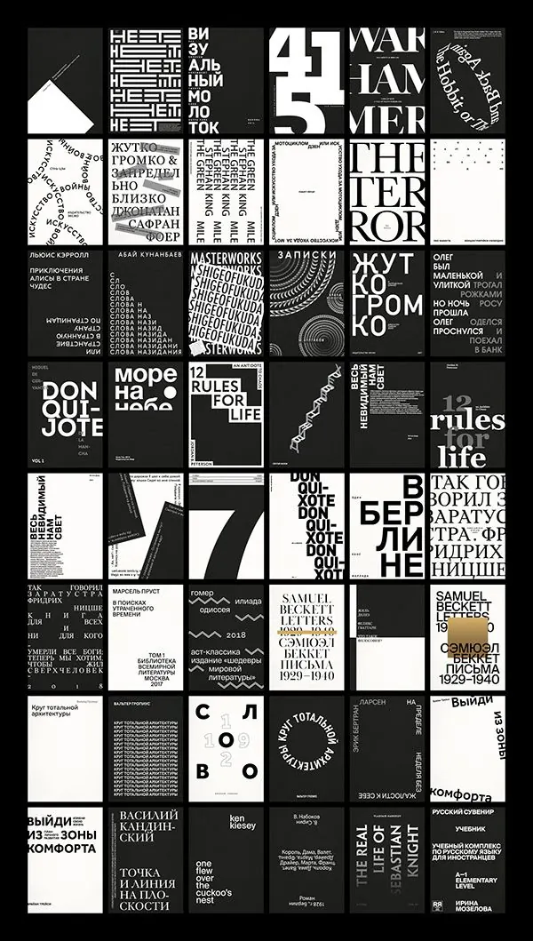
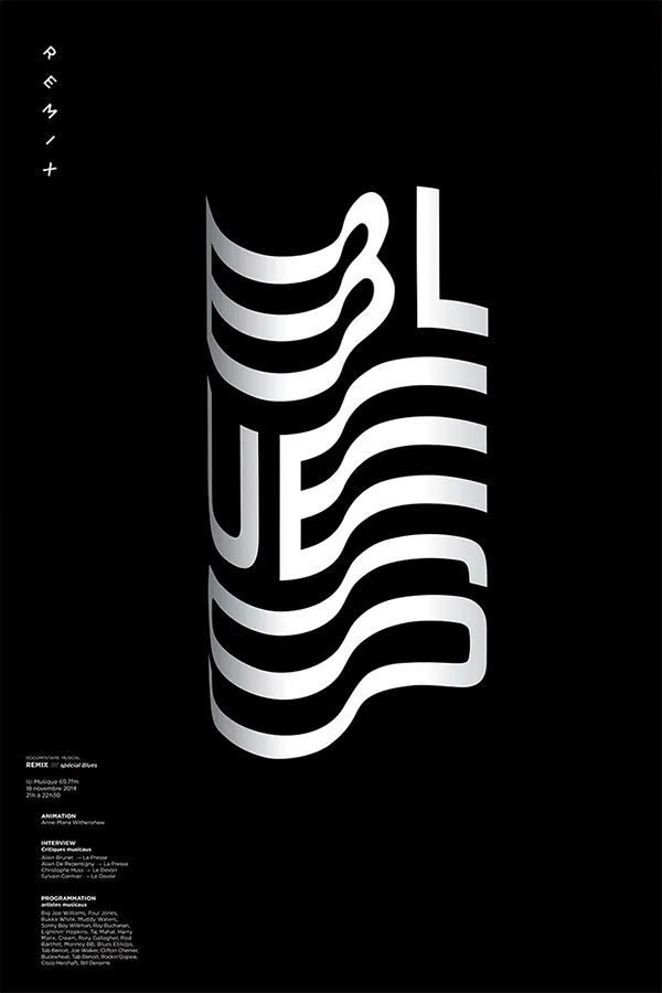
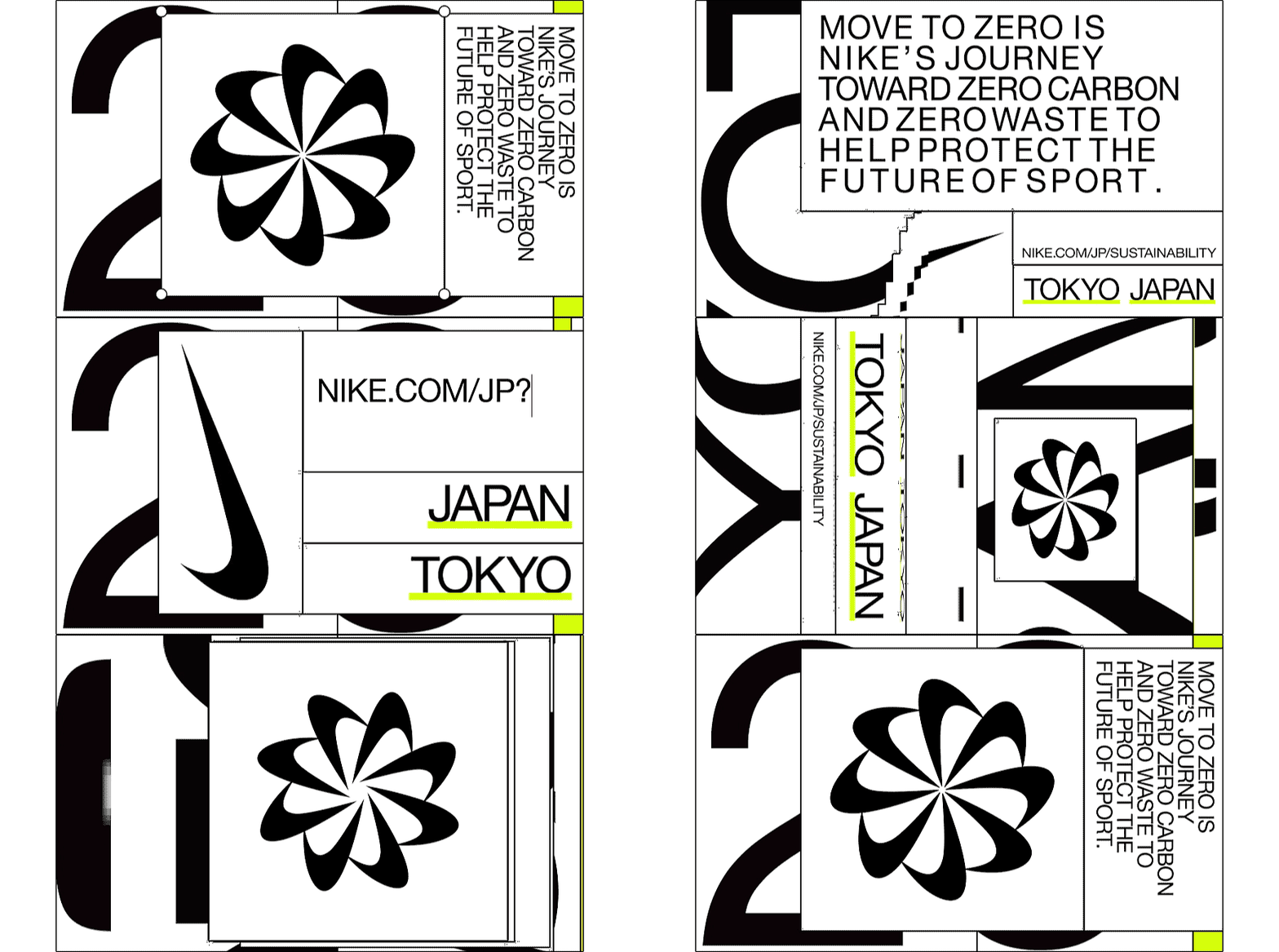
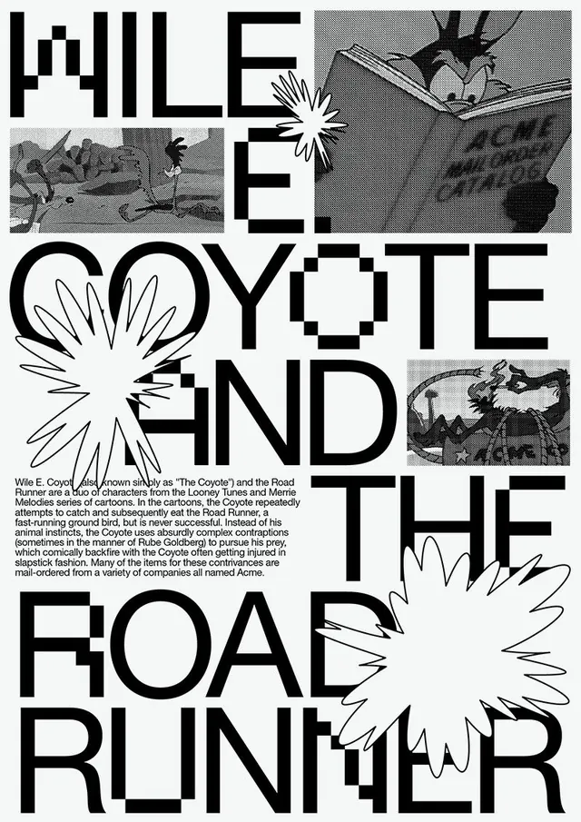
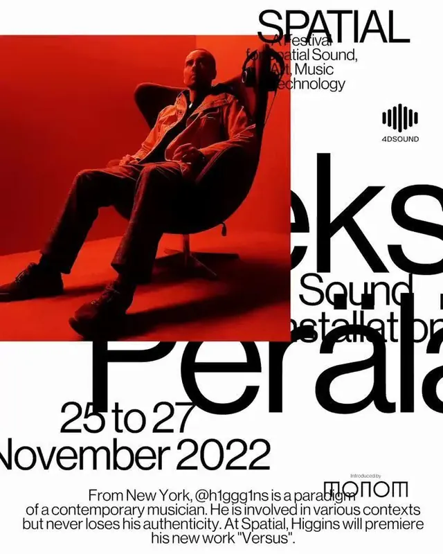
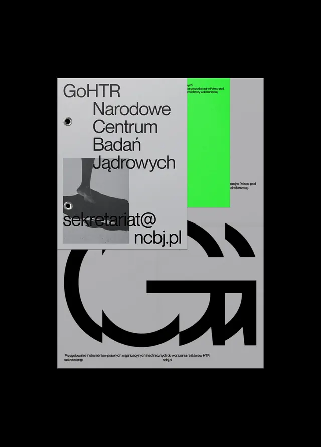
A monochrome poster layout with oversized black typography, a neon green vertical accent block, and layered graphic panels on a light gray field.
Summary
A monochrome poster layout with oversized black typography, a neon green vertical accent block, and layered graphic panels on a light gray field.
Visual description
The image shows a tall poster centered on a black background, built from a light gray base with layered rectangular panels. Large black sans-serif text dominates the upper half, a bright neon green vertical rectangle sits near the top right, and a cropped grayscale photo panel appears on the left. The lower half features oversized black curved letterforms and a small line of text at the bottom.
Key takeaway
Use one strong neon accent against an otherwise restrained monochrome system to create hierarchy instantly. Combine oversized typography with layered panels so the layout feels editorial and tactile.
Reuse notes
This works well for cultural posters, institutional identities, and experimental brand collateral. Reach for it when you want a serious tone but still need one sharp visual hook to break the grid.