Preview image. Unlock full-res
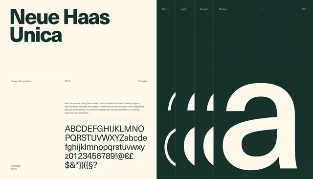
A two-panel type specimen layout showing the Neue Haas Unica typeface with large sample text, weights, and alphabet and symbol specimens.

Summary
A two-panel type specimen layout showing the Neue Haas Unica typeface with large sample text, weights, and alphabet and symbol specimens.
Visual description
The image is split vertically into a light cream left half and a deep green right half. The left side contains the large headline "Neue Haas Unica," small explanatory text, a year, and specimen lines with alphabet, numbers, and symbols, while the right side shows weight labels across the top and oversized cropped letterforms filling the panel.
Key takeaway
Use a strict split-panel composition to contrast informational typography with oversized specimen forms. Keep the hierarchy sparse so the type itself becomes the main visual.
Reuse notes
This works well for font launches, editorial typography spreads, and identity presentations. Use it when you want a premium, restrained look that still feels graphic and bold.