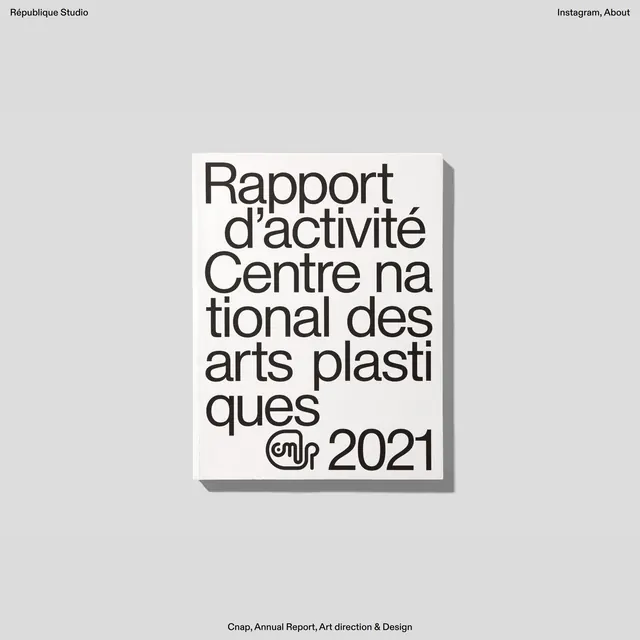
Preview image. Unlock full-res
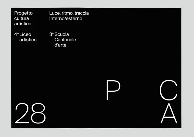
A minimalist black and white poster for an art school using sparse typographic hierarchy and large spacing.
Summary
A minimalist institutional poster with Italian educational institution names and program descriptions positioned in the upper-left, large numbers and letters scattered across the composition on a black rectangle set against a gray background.
Visual description
A horizontal poster design with a light gray background and a black rectangle containing white typography. Upper-left corner features three lines of small italic sans-serif text (institution names and programs in Italian). Lower section is dominated by large, spaced-out numerals and letters in light sans-serif: "28" on the far left, "P C" on the far right, and "A" beneath the P. The composition uses dramatic white-space and an asymmetric layout. All text is sans-serif in various weights and sizes.
Key takeaway
The extreme use of white-space and asymmetric positioning of large display type creates visual interest without ornament. The interplay between dense information hierarchy (small text) and bold typographic elements (large isolated letters) draws attention and creates intrigue. The monochromatic palette emphasizes structure and form over color.
Reuse notes
Excellent reference for educational institution posters, minimal typography-driven design, and contemporary print design. Works well for galleries, arts organizations, or cultural institutions wanting a sophisticated, understated identity. The sparse approach is memorable and elegant but requires confidence in typography choice. Best applied at large scale where the compositional spacing can breathe.