Preview image. Unlock full-res
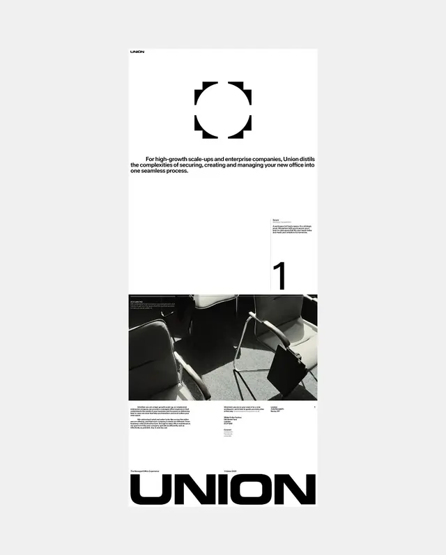
A minimalist editorial poster layout for Union featuring a geometric circle logo, monochromatic photography, and bold sans-serif wordmark on a light background.

Summary
A clean editorial poster for a company called Union, featuring a geometric circle mark, positioned photography, numbered section headers, and a bold condensed wordmark anchoring the bottom.
Visual description
Set against an off-white background, the composition balances generous whitespace with strategic visual elements. A small UNION logo sits top left in sans-serif. A geometric circle formed by four corner marks dominates the upper third, creating a framing device. Center displays descriptive body copy positioned to the left of the circle. A numbered section with black and white architectural photography occupies the middle, followed by supporting text captions. The bold UNION wordmark in black sans-serif type anchors the bottom, rendered at display size with strong visual weight.
Key takeaway
Minimalist Swiss design principles applied to corporate communication. Generous whitespace, geometric framing, and bold typography create authority while maintaining elegance and approachability.
Reuse notes
Excellent template for B2B corporate branding, business services, and professional consulting. The geometric logo system is adaptable to different industries. The black and white palette with clean typography remains timeless and conveys professionalism.