Preview image. Unlock full-res
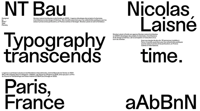
Typographic poster layout for architect Nicolas Laisne with bold sans-serif headlines, descriptive body text, and geographies arranged in an asymmetric grid.
Summary
A minimal black-and-white typographic poster for architect Nicolas Laisne, using bold sans-serif headlines and small descriptive text arranged in an asymmetric layout.
Visual description
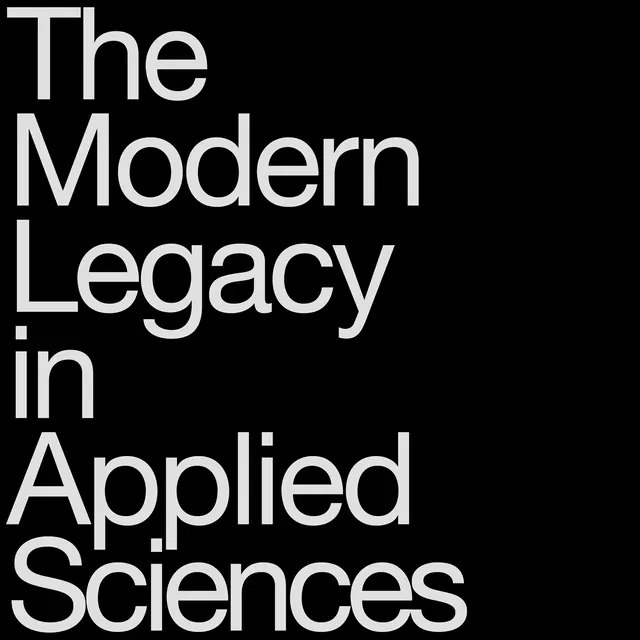
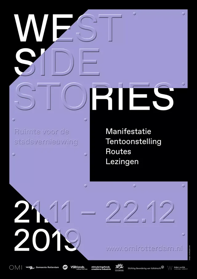
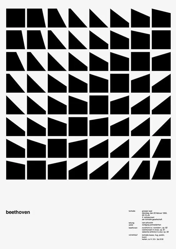
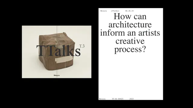
Composition built primarily of typography in black on white. Bold headlines read "NT Bau," "Nicolas Laisne," "Typography transcends," and "time." positioned in a dynamic asymmetric grid. Smaller body text appears in paragraphs providing context and description. Geographic indicators "Paris, France" and typographic specimen text "aAbBnN" fill additional spaces. No images or illustrations. Layout uses clear hierarchy through size contrast. Clean, minimal spacing. Professional typography rendered in what appears to be a contemporary sans-serif typeface.
Key takeaway
Typography itself can be the primary design element when composed with clear hierarchy and strategic spacing. Bold sans-serif type combined with minimal text creates high-impact professional communication.
Reuse notes
Excellent reference for architectural or creative professional branding. Works well for portfolio presentations or professional directories. The monochromatic palette is timeless and works at any scale. Strong model for Swiss-style graphic design and editorial layouts. Translates well to posters, business cards, or web applications.