Preview image. Unlock full-res
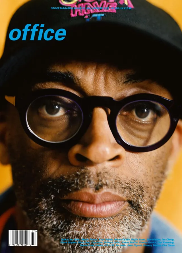
A magazine cover portrait of a person wearing black-framed glasses and a black cap, shot against a bright saturated yellow background with cyan and magenta typography overlays.
Summary
A magazine cover design featuring a close-up portrait of a person wearing glasses and a black cap against a bright yellow background, with overlaid magenta and cyan typography.
Visual description
The main subject occupies the center of the frame, facing directly toward the camera. They wear large black-framed round glasses and a black baseball cap that obscures much of the hairline. Warm brown skin tones and a grey-brown beard are the focal point. The background is a solid bright saturated yellow-gold that creates maximum contrast with the subject's dark features. Blue italicized text reading "office" appears on the left side in large, bold type. Magenta and bright cyan text elements are scattered across the top and lower portions of the frame, creating visual complexity. Small cyan text and a barcode appear at the bottom. The overall aesthetic is contemporary, playful magazine design with strong typography.
Key takeaway
Solid color backgrounds and overlaid typography as a design system for editorial work. The bright yellow background ensures immediate visual impact and legibility. Layered text in complementary colors creates depth and contemporary magazine aesthetics.
Reuse notes
Strong reference for magazine covers, editorial design, and contemporary publication layouts. The bright, solid background works well for print and digital media. The typography overlay technique is a classic editorial approach that remains contemporary. Works particularly well for design-focused or cultural publications. The portrait style is approachable and professional, suitable for thought leadership or artist features. Requires careful typography selection and kerning to avoid visual chaos when layering text. The bright yellow background will reproduce differently across media, so consider adjustments for digital vs. print. Excellent reference for publication designers and editorial art directors.