Preview image. Unlock full-res
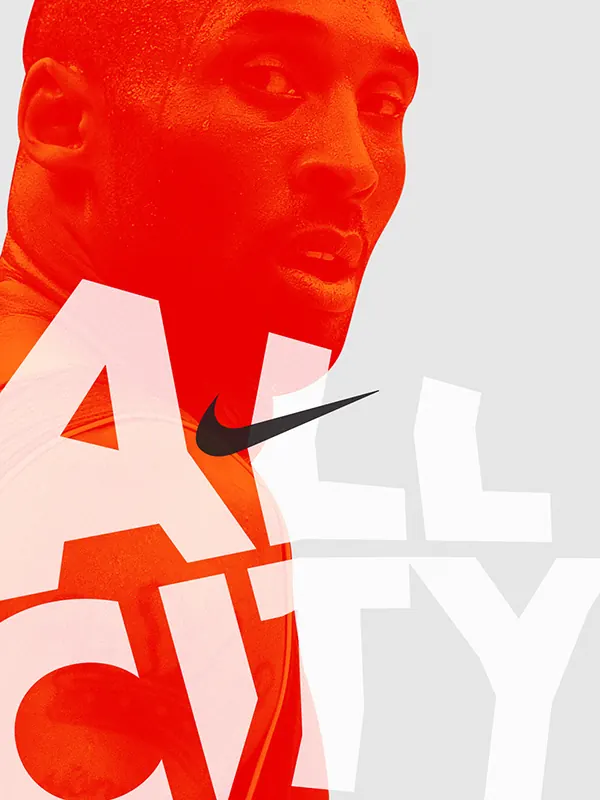
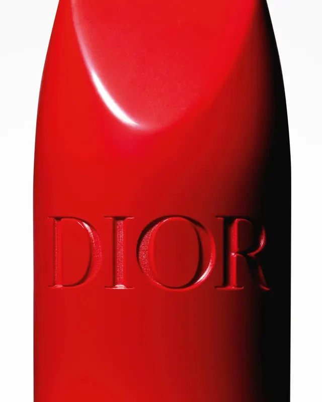
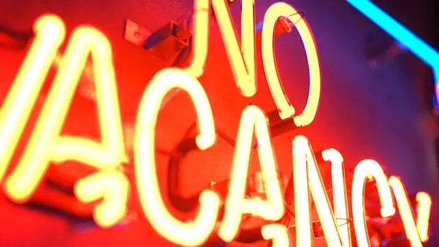
Magazine cover with bold neon-inspired typography overlaid on rich color palette mixing purple, red, and cream.
Summary
The Atlantic magazine's April 2019 cover features bold neon-inspired typography in cream and red set against a rich deep purple and red gradient background.
Visual description
The cover is dominated by large, bold display typography reading "APRIL 2019" in luminous cream and bright red. The letters appear to glow against a background gradient flowing from deep purple on the left through rich red tones on the right. A pale cream-yellow hue occupies portions of the composition. The typography treatment suggests neon or glowing effects through color choice and weight. The overall effect is contemporary and energetic.
Key takeaway
Bold typography paired with saturated color gradients creates immediate visual impact and contemporary authority. Neon-inspired effects suggest modernity without requiring actual effects.
Reuse notes
Excellent reference for editorial design, magazine covers, or publication-focused brands. The bold typography and vibrant color palette work well for contemporary, youthful, or cutting-edge editorial voices. Effective for covers, posters, or promotional materials targeting engaged audiences.