Preview image. Unlock full-res
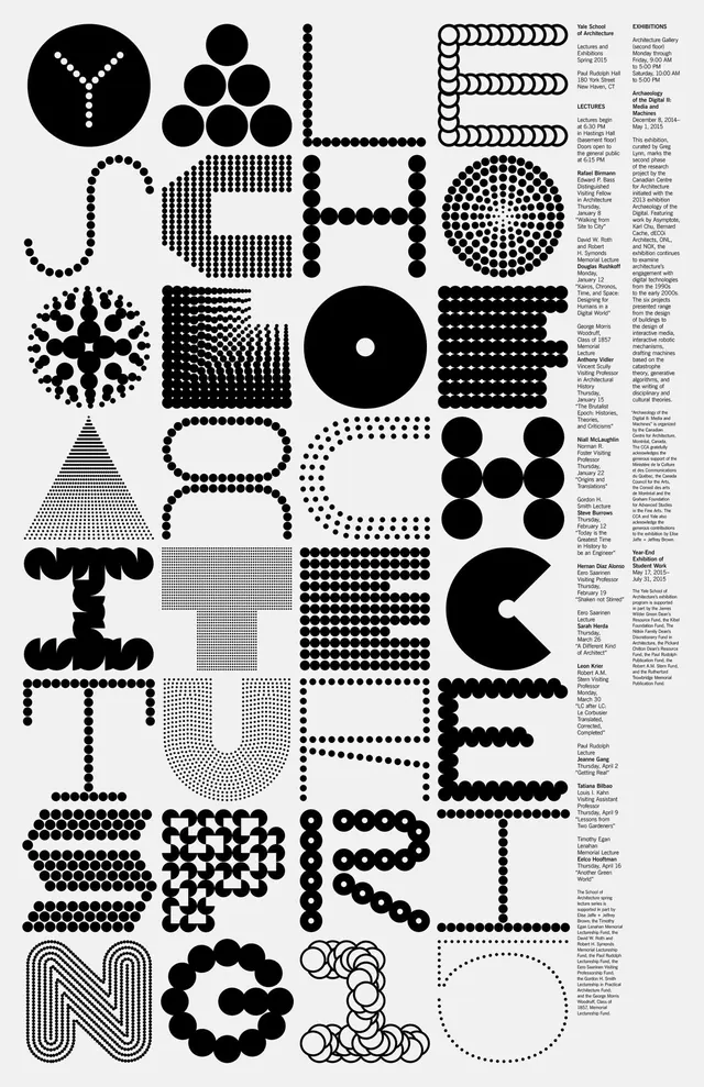
A comprehensive typographic and pattern poster for Yale's architecture school, designed by Michael Bierut, featuring an intricate grid of geometric shapes, dots, lines, and letterforms in black and white.
Summary
A masterclass in modular typography and pattern design: Pentagram's Michael Bierut created a dense, intricate poster for Yale's Spring 2015 architecture program entirely from geometric primitives (circles, dots, lines, grids) arranged into letters and forms.
Visual description
The poster is an all-type composition on white, filled with a dense array of black geometric elements: circles (both filled and outlined), dots (organized in grids and patterns), dashed and solid lines, filled shapes, and halftone grids. Within the chaos, the word "YALE" emerges constructed from these elements, with each letter built from a different modular system (circular motifs, dotted patterns, linear arrangements, etc.). Text information runs along the right edge in a single-column list. The overall effect is a field of pattern and texture that rewards close study, revealing order and design logic beneath apparent complexity.
Key takeaway
Swiss modernism applied to the full typographic spectrum: the poster proves that without a single letterform, a designer can build legible, beautiful typography using pure geometry, pattern, and rhythm. The "YALE" construction serves as both logo and design manifesto.
Reuse notes
Ideal for design schools, architecture programs, and intellectually rigorous brands that want to broadcast systematic thinking and craft. The monochromatic, data-dense approach suits educational posters, catalogues, and premium print. The poster demonstrates core design principles (modular systems, repetition, contrast) and serves as a reference for geometric pattern design. The composition is complex enough to intrigue viewers but disciplined enough to remain professional.