Preview image. Unlock full-res
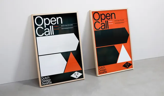
Two printed postcards or flyers for a design competition, featuring bold black and orange geometric shapes and minimalist Swiss typography on cream background.
Summary
Two matching postcards for the Dutch Design Awards, each featuring bold geometry dividing the card: black and orange sections framing a white space, with large "Open Call" typography.
Visual description
Two identical printed cards are displayed at an angle. Each features a minimalist composition: cream-colored background divided by bold geometric shapes in black (upper left and bottom) and a bright orange-red triangle (center-right). Large white sans-serif type reads "Open Call" in the black section. The bottom-right corner shows the Dutch Design Awards logo in small scale. Information text appears in white on the black field. The design is clean, high-contrast, and deliberately asymmetric.
Key takeaway
Swiss-style geometry applied to event identity. The color blocking (black, orange, white, cream) is distinctive and memorable. The negative space is as important as the shapes, creating visual balance and legibility.
Reuse notes
Effective template for design competitions, cultural events, or institutional branding. The two-color approach is cost-effective for printing. Works across postcards, posters, and digital applications. The asymmetry creates visual interest without complexity.