Preview image. Unlock full-res
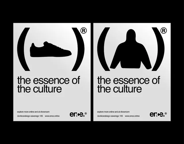
A black-and-white poster layout shows two side-by-side graphic panels with large bracket forms, silhouette icons, and the phrase \"the essence of the culture.\
Summary
A black-and-white poster layout shows two side-by-side graphic panels with large bracket forms, silhouette icons, and the phrase "the essence of the culture."
Visual description
The image shows two poster-like compositions placed side by side on a black background. Each white panel contains oversized black bracket shapes, a central silhouette icon, the repeated text "the essence of the culture," and a small logo-like mark near the bottom right.
Key takeaway
Use a stark black-and-white palette with oversized framing symbols to give a simple message a strong identity presence. The repeated two-panel structure makes the concept feel systematic while still allowing variation in the central icon.
Reuse notes
This works well for fashion, culture, or retail branding when you want a minimal but assertive campaign image. It is most effective when the message is short and the graphics can carry the meaning without much supporting copy.