Preview image. Unlock full-res
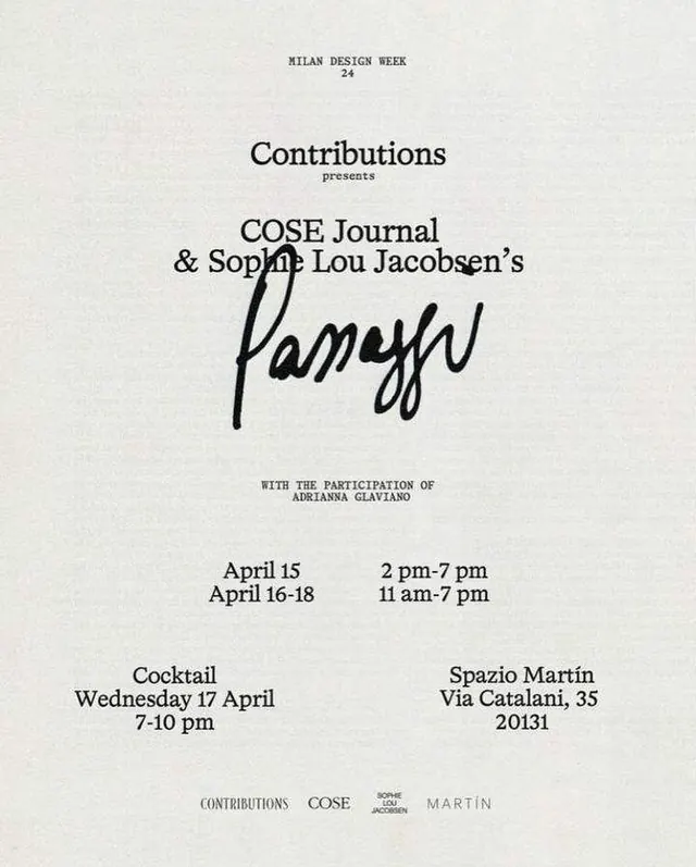
A minimalist black-and-white event poster for Milan Design Week featuring centered typography and a large handwritten-style title.
Summary
A minimalist black-and-white event poster for Milan Design Week featuring centered typography and a large handwritten-style title.
Visual description
The image shows a centered, text-only poster on an off-white textured background. Small uppercase text appears at the top, larger serif event copy sits in the middle, and a bold handwritten signature-style word dominates the center.
Key takeaway
Use a strict centered hierarchy with one oversized expressive word interrupting an otherwise restrained serif layout. The contrast between formal type and a single handwritten mark gives the piece its identity.
Reuse notes
Reach for this when you want an invitation, exhibition, or fashion-culture poster to feel refined and editorial without adding imagery. It works best when the type itself is the main content and the canvas can stay sparse.