Preview image. Unlock full-res
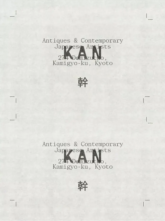
A monochrome print layout shows repeated centered typography blocks with the word KAN over a paper-textured background and crop marks at the corners.
Summary
A monochrome print layout shows repeated centered typography blocks with the word KAN over a paper-textured background and crop marks at the corners.
Visual description
The image is a pale, textured paper page with small crop marks placed near the corners and a large amount of empty space. In the center, a serif headline and address text are repeated twice, with a bold overprinted KAN wordmark and a single Japanese character placed below each block.
Key takeaway
Use strict central alignment with layered typography to create a quiet but intentional print-object feel. The contrast between delicate serif copy and a heavy overprinted wordmark gives the layout its tension.
Reuse notes
This works well for posters, zines, labels, and identity sheets where a tactile, archival tone is useful. It is strongest when the palette stays near-monochrome and the composition can breathe with lots of negative space.
More like this




Keep what you find
A free account saves references to boards and can send you a weekly email of picks based on what you save.
To see every result, go Pro.