Preview image. Unlock full-res
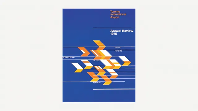
Retro typographic cover design for Toronto International Airport Annual Review 1975 featuring geometric arrow shapes in gold, blue, and white.
Summary
A 1975 Toronto International Airport annual review cover using bold geometric chevron shapes in gold and white against a deep blue background with clean sans-serif typography.
Visual description
Dark blue background with centered composition featuring "Toronto International Airport" and "Annual Review 1975" in white sans-serif type. Below, a stacked chevron pattern—stylized arrows in gold, white, and darker blue—creates visual movement. Thin horizontal lines frame sections of text, defining information hierarchy. The design demonstrates classic mid-1970s Swiss style with geometric precision and corporate restraint.
Key takeaway
The repeating chevron motif is both decorative and directional, suggesting forward movement and activity. The color palette of rich gold against dark blue conveys both corporate authority and warmth.
Reuse notes
Effective template for transportation, logistics, or infrastructure branding needing to communicate progress and reliability. The geometric treatment dates the design distinctly to the 1970s; works well for retrospective or heritage brand positioning. Gold and dark blue combination is luxe and corporate simultaneously.
More like this




Keep what you find
A free account saves references to boards and can send you a weekly email of picks based on what you save.
To see every result, go Pro.