Preview image. Unlock full-res
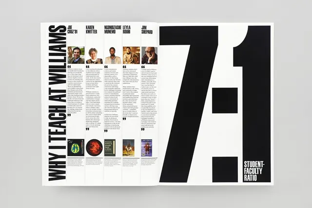
Editorial magazine spread featuring "Why Teach at Williams" with portraits, text columns, and a bold tilted number 7 design element.
Summary
An editorial magazine spread for Williams College featuring the headline "Why Teach at Williams," with faculty portraits, interview-style text blocks, and a striking large black tilted "7:1" graphic element.
Visual description
Two-page spread in black and white. Left page: Vertical headline "WHY TEACH AT WILLIAMS" in all-caps, bold sans-serif. Below: Five portrait photographs of faculty members arranged horizontally with accompanying interview text in narrow columns. Right page: A bold, oversized tilted number "7" in black, with smaller text "STUDENT-FACULTY RATIO" below. The asymmetrical layout balances dense type with generous white space and dramatic typography.
Key takeaway
Tilted oversized numerals used as a design anchor without requiring illustration; combining portraiture and text-based interviews in a compact, readable grid creates visual hierarchy and authority.
Reuse notes
Strong model for educational or professional services advertising; the student-faculty ratio graphic is particularly effective for conveying institutional value.
More like this



Keep what you find
A free account saves references to boards and can send you a weekly email of picks based on what you save.
To see every result, go Pro.