Preview image. Unlock full-res
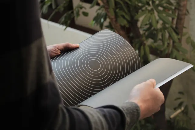
A person holds and flips through large printed sheets featuring a dark grey background with white concentric circles.
Summary
A person holds and flips through large printed sheets featuring a dark grey background with white concentric circles.
Visual description
A person's hands hold two large sheets of paper. One sheet displays a dark grey surface with thin, white concentric circles radiating from a central point, while the other sheet appears as a solid dark grey surface.
Key takeaway
Use high-contrast geometric line patterns to create visual depth and focus in minimalist layouts.
Reuse notes
Use this when designing minimalist branding, wallpaper patterns, or sophisticated editorial backgrounds.
More like this


Keep what you find
A free account saves references to boards and can send you a weekly email of picks based on what you save.
To see every result, go Pro.