Preview image. Unlock full-res
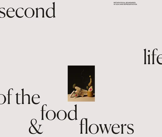
An editorial design poster with asymmetric serif typography spelling "The Second life of the food & flowers" on a light background, featuring a centered still-life photograph.
Summary
An editorial poster with large asymmetric serif typography arranged around a centered still-life photograph of food and flowers, all on a cream background.
Visual description
A light cream-beige background holds black serif typography in varied sizes and positions. The words "second", "of the", "food", "life", "& flowers" are scattered asymmetrically around the composition. In the center is a small-scale framed photograph showing arranged food items and flowers on a dark background. Above the image reads a small line of text: "METAPHYSICAL BOUNDARIES IN OUR OWN REPRESENTATION". The typography uses a traditional serif face, likely a classical editorial font. The negative space dominates the layout. The overall effect is deliberately spare and conceptual, emphasizing the contrast between the typographic abstraction and the singular photographic element.
Key takeaway
Asymmetric typography with large variable sizing creates visual interest without hierarchy. A small central image anchors conceptual type-only compositions.
Reuse notes
Excellent reference for editorial, publishing, and gallery design. The minimalist approach works for exhibition posters, book covers, and art publication layouts. The serif typography conveys literary or cultural credibility. Useful for designers exploring conceptual poster design where content is split between type and image. The cream-and-black palette reads as sophisticated and gallery-appropriate.