Preview image. Unlock full-res
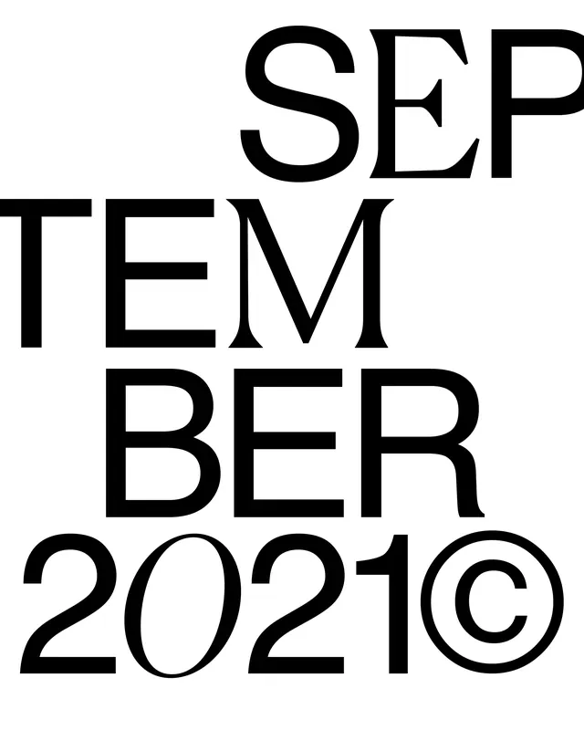
Monochrome typographic poster splitting SEPTEMBER into three-letter rows above 2021 with high-contrast Didone serifs.
Summary
Black high-contrast serif letters stack as SEP, TEM, and BER above a 2021 copyright line on white negative space.
Visual description
White background with a compact vertical text block. Didone capitals with extreme thick-thin contrast and tight kerning form three syllable rows with slight staggered alignment. Bottom line reads "2021©" in the same face at similar scale. No imagery or color beyond black ink on white.
Key takeaway
Breaking a month name into syllable rows turns calendar typography into a graphic rhythm without illustrations or palette shifts.
Reuse notes
Seasonal editorials, publishing mastheads, or date-mark systems that treat time as pure letterform composition.