Preview image. Unlock full-res
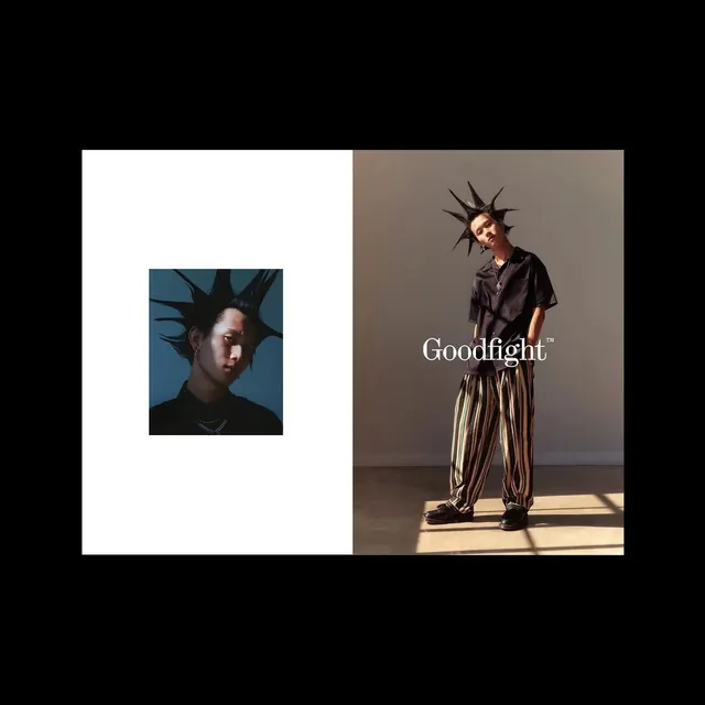
A split-composition fashion editorial featuring two portrait studies: a small blue-toned image on the left and a full-length figure shot on the right with "Goodfight" branding, separated by black borders.

Summary
A symmetrical fashion editorial layout split into two sections: a smaller cool-toned portrait image on white background (left) and a full-length studio photograph on taupe background (right), unified by "Goodfight" typography.
Visual description
The composition is divided in half by vertical black borders. The left half is predominantly white with a smaller square photograph inset, showing a portrait with cool blue lighting and spiky hair styling. The right half features a full-length portrait of a model wearing dark clothing and striped pants, standing in dramatic golden-hour sunlight. A serif typeface reading "Goodfight" in white sits prominently in the center of the right image. The entire layout is framed by black borders at the top and bottom, creating a structured, editorial magazine feeling. The color palette transitions from cool tones (left) to warm tones (right).
Key takeaway
The split composition creates visual interest through contrast while maintaining symmetry. The typography placement is confident and central. The transition from cool to warm lighting across the spread creates psychological movement. Generous use of white space conveys luxury and editorial sophistication.
Reuse notes
Excellent reference for fashion editorial design, magazine layouts, or beauty branding. The split composition is effective for contrasting ideas or presenting before/after concepts. The minimalist framing with black borders is contemporary and high-end. Works well for luxury brands, fashion publications, or artistic portfolios. The typography treatment is sophisticated and readable. The lighting contrast between the two sides is a design lesson in creating visual narrative.
More like this
Keep what you find
A free account saves references to boards and can send you a weekly email of picks based on what you save.
To see every result, go Pro.