Preview image. Unlock full-res
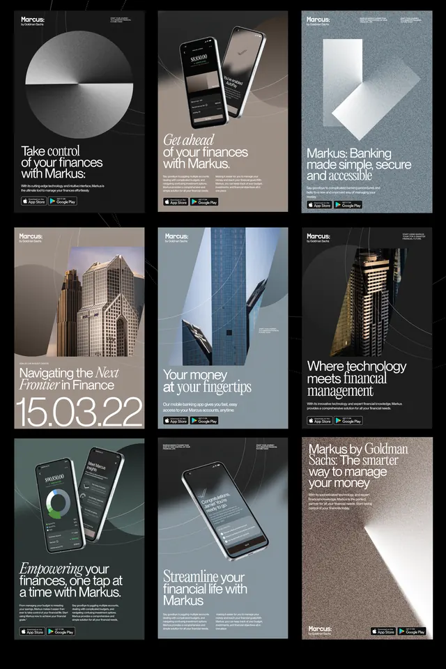
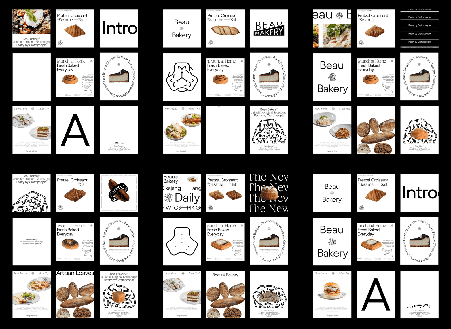
A black-backed collage of minimalist bakery posters and word-driven layouts featuring pastries, oversized typography, and lots of white space.
Summary
A black-backed collage of minimalist bakery posters and word-driven layouts featuring pastries, oversized typography, and lots of white space.
Visual description
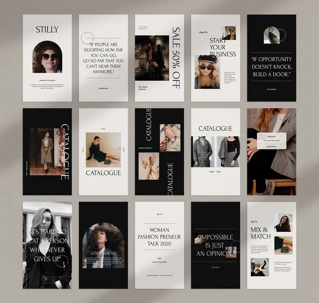
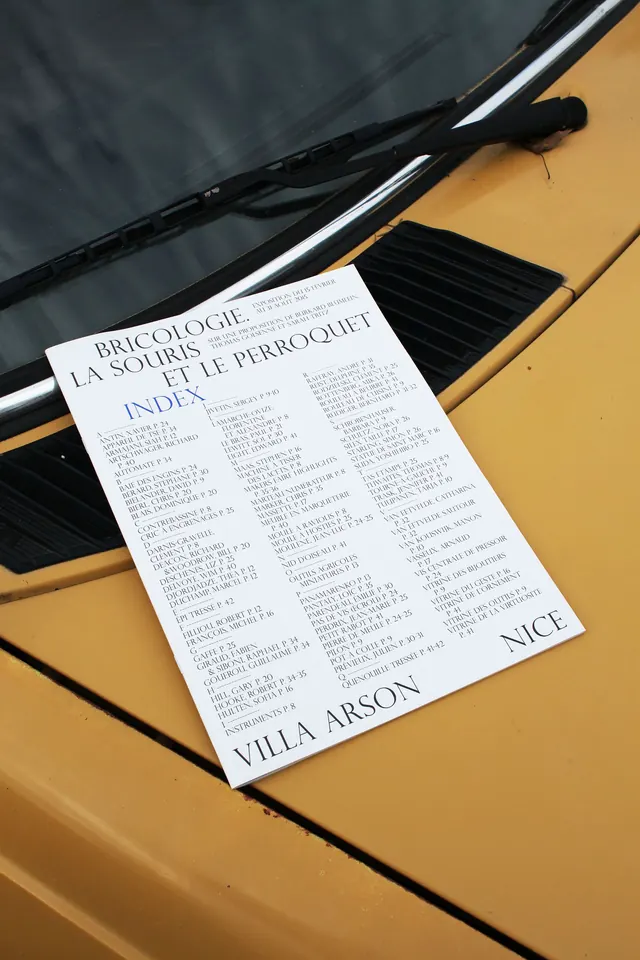
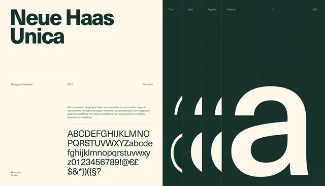
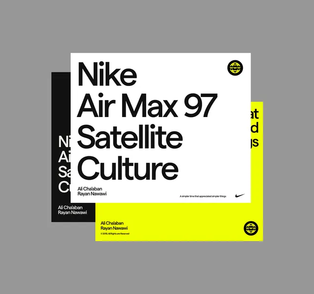
The image shows a 3 by 3 grid of bakery-themed poster designs on a black background, with several mostly white compositions and a few image-heavy ones. Most panels combine large serif or sans-serif headlines with cutout pastry photography, circular text, or sparse footer details.
Key takeaway
Use a strict white canvas with strong typographic hierarchy and a single centered food image to make each poster feel airy and premium. Mixing refined serif type with oversized sans-serif headlines creates a crisp editorial contrast.
Reuse notes
Reach for this approach when designing bakery, cafe, or menu promotions that need to feel modern and elevated. It also works for brand moodboards or inspiration boards where varied compositions need to read as one coherent system.