Preview image. Unlock full-res
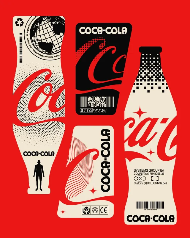
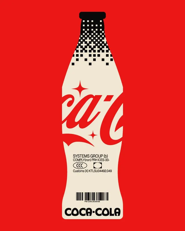
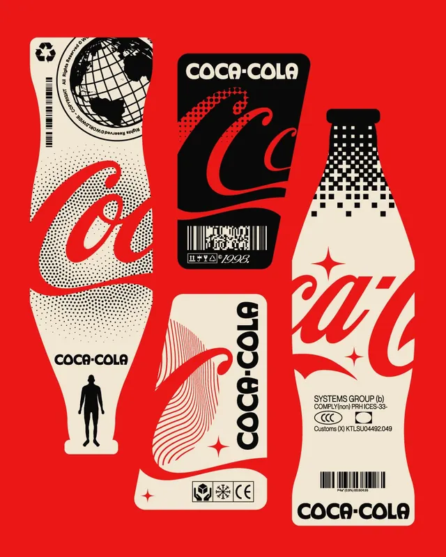
Five experimental typographic and graphic reworks of Coca-Cola bottle and package formats, mixing retro halftone, line-art, geometric patterns, and high-contrast monochrome with bright red backgrounds.

Summary
A bold experimental series reinterpreting Coca-Cola's iconic bottle and branding through five distinct visual treatments, each combining different graphic techniques-halftone texture, line-art, geometric patterns, and dense information design-against vivid red backgrounds.
Visual description
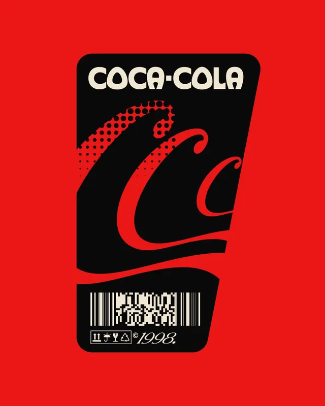
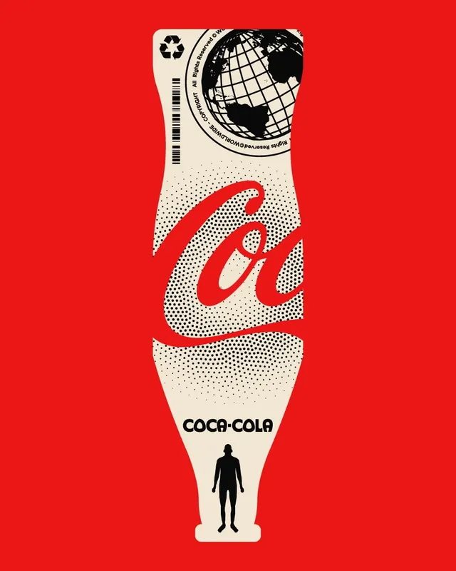
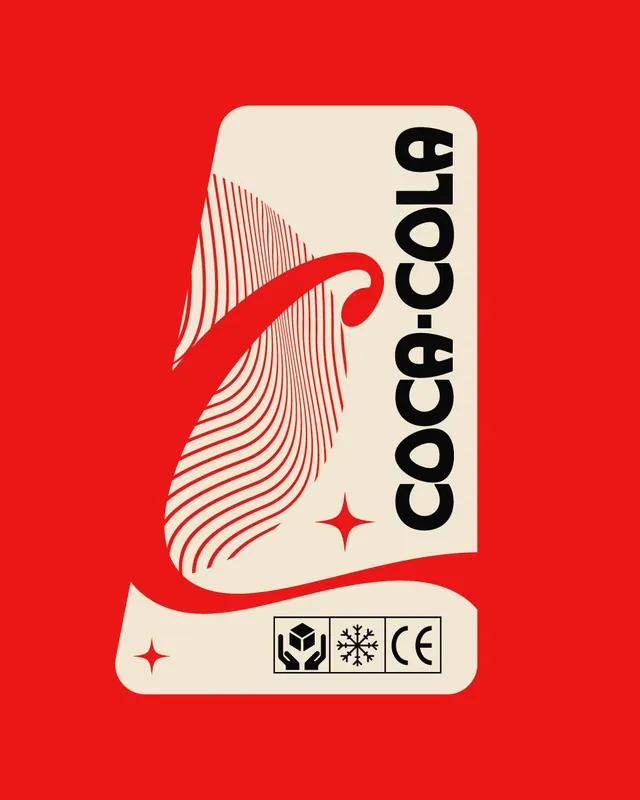
Slide 1: Tall bottle shape split vertically: left side shows white dotted halftone pattern on red curvy "C" script, globe graphic stamp at top; right side shows white field with small black Coca-Cola wordmark and silhouette figure at base. Slide 2: Clean bold black rounded rectangle with red flowing wave and scattered dotted accent, white space for Coca-Cola text and 1993 date mark with barcode. Slide 3: Black-and-white gradient checker pattern descending from cap to base, creating three-dimensional perspective illusion, with red curved script "C" overlaid. Slide 4: Cream-colored background with red wave line-art pattern (parallel flowing lines), reading "coca-cola" vertically in bold black sans-serif, small red star accents. Slide 5: Bottle outline with large pixelated/checker gradient fade from dense black to scattered dots at top, thick red script "W" (or partial logo), regulatory marks and barcodes at base.
Key takeaway
Each variation explores a different graphic principle-texture (halftone), pattern (geometric, wave, pixelation), information density, and scale. Despite wildly different approaches, they remain recognizably Coca-Cola through consistent red-and-cream palette and bottle proportions. Shows how a strong brand can sustain experimental deconstruction without losing identity.
Reuse notes
Excellent reference for packaging redesign exploration or visual systems that need to maintain brand recognition while pushing formal boundaries. The range of treatments proves useful for pitching multiple directions to a client or exploring a design concept's flexibility. Best suited for bold, design-forward brands comfortable with experimental presentation. The halftone and line-art techniques age well and work particularly strong in print or limited-edition contexts. Less suited for minimal or premium brands seeking restraint.