Preview image. Unlock full-res
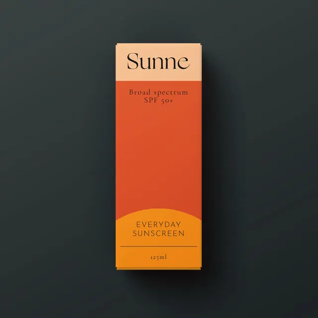
Minimalist sunscreen product packaging with warm color-blocking: cream top section with brand name, burnt-orange mid-section, and golden-yellow bottom accent.
Summary
A product package for Sunne sunscreen with horizontal color-blocking: a cream top panel with the brand name, a burnt-orange mid-section, and a golden-yellow base with product details.
Visual description
Clean rectangular packaging divided into three distinct horizontal zones: a warm cream panel at top with serif-style "Sunne" branding, a large burnt-orange section stating "Broad spectrum SPF 50+", and a smaller golden-yellow base stripe with product volume and additional text. Simple serifs in the typography, drop shadow on the package suggesting depth.
Key takeaway
Warm, inviting color-blocking communicates sun protection and natural ingredients without needing photography. Horizontal divisions create visual rhythm and segment information clearly.
Reuse notes
Strong template for natural beauty or wellness products wanting to convey warmth and approachability. Works especially well for skincare where color psychology can signal sun protection or organic ingredients.