Preview image. Unlock full-res
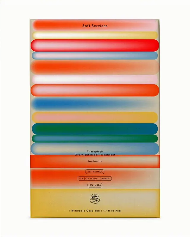
Hand cream packaging using horizontal stacked rounded bars in warm hues (coral, red, teal, blue, gold) as the primary visual hierarchy.
Summary
A cosmetic product packaging design stacking horizontal bars in warm, gradient-filled colors to communicate product ingredients and benefits through visual rhythm rather than traditional layout.
Visual description
Vertical composition with horizontal rounded-rectangle bars in coral, red, gold, blue, teal, and blended gradient fills. Each bar has soft feathered edges and represents a product variant or ingredient layer. Near the top, "Soft Services" appears in serif type within a coral bar. The lower third contains ingredient callouts (retinol, colloidal oatmeal, urea) and "Theraplush Overnight Repair Treatment" copy, plus "for hands" and refill case details. The background is soft beige. Each colored bar has smooth gradient transitions from saturated edges to muted centers, creating depth and tactile appeal.
Key takeaway
The stacked-bar composition as a primary visual system: each horizontal band reads as a self-contained product layer or benefit, building brand recognition without ornament. The gradient-fill technique (saturated edge fading to tint) keeps the palette cohesive while signaling premium, skincare-grade quality. Using rounded endpoints softens geometric color-blocking into a friendly, approachable rhythm.
Reuse notes
Strong for cosmetic, supplement, or wellness packaging where ingredient transparency and multi-product variants need visual differentiation without clutter. Works especially well on tall, narrow formats (boxes, tubes, refill pods). The warmish palette reads as skin-safe and natural; adapt the color order to signal product benefits (e.g. blue for hydration, gold for nourishment).
More like this




Keep what you find
A free account saves references to boards and can send you a weekly email of picks based on what you save.
To see every result, go Pro.