Preview image. Unlock full-res
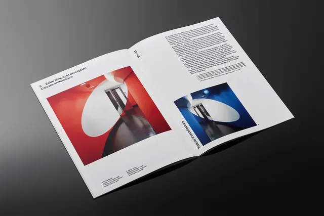
Two-page editorial layout showing minimalist product or still-life photography in complementary color schemes—red and blue backgrounds with white sculptural forms.
Summary
A minimalist two-page magazine spread using bold color blocking—red and deep blue—with complementary still-life or product photography featuring white sculptural forms and text layouts.
Visual description
An open magazine spread with a tightly bound spine at center. The left page features a red-orange background with a white sculptural form and a black architectural or product element photographed in sharp detail. The right page mirrors the concept with a deep blue background, a similar white form, and coordinated black architectural elements. Both pages use minimal sans-serif typography in small point sizes. The sculptural forms appear identical or highly similar, photographed against contrasting vibrant backgrounds. The overall layout is perfectly centered and symmetrical, suggesting careful art direction. The paper is matte, suggesting fine art or design publication quality.
Key takeaway
Using complementary color backgrounds (red/blue) with identical subject matter creates rhythm and visual cohesion across a spread. Minimal typography and white forms against saturated color backgrounds read as premium and focused. Symmetrical layouts can feel controlled and editorial without being stiff.
Reuse notes
Excellent for design publications, art catalogs, luxury brand campaigns, or institutional communications requiring visual authority. The color-blocking technique is bold enough for print but reads as sophisticated, not garish. Works well for collections or paired content. Pairs perfectly with minimal sans-serif typography and plenty of whitespace. Requires high-quality product or still-life photography to carry the visual weight.
More like this
Keep what you find
A free account saves references to boards and can send you a weekly email of picks based on what you save.
To see every result, go Pro.