Preview image. Unlock full-res
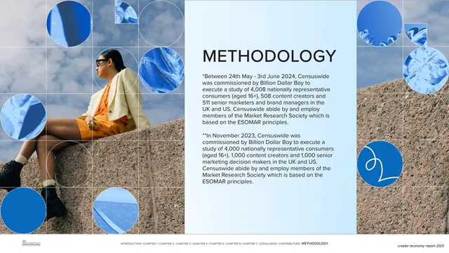
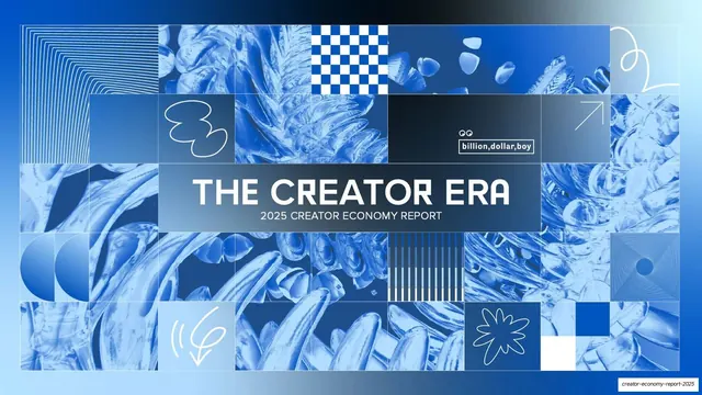
A 46-slide creator-economy trends report built on a cobalt-blue grid of duotone abstract imagery, bold condensed all-caps headlines, and a repeating chapter / prediction / evidence / stats rhythm.
Summary
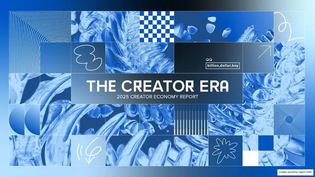
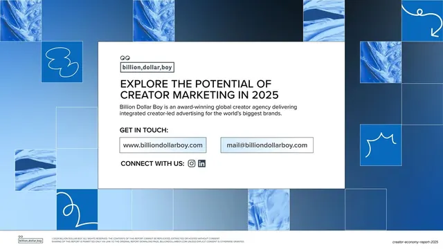
A 46-slide annual trends report from creator-marketing agency Billion Dollar Boy ("The Creator Era: 2025 Creator Economy Report"). Its identity comes from one dominant device: a grid mosaic of cobalt-blue duotone abstract textures used as the recurring background and section system, against which bold condensed all-caps headlines and clean sans body copy carry the data.
Visual description
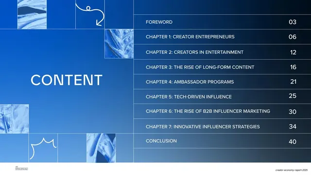
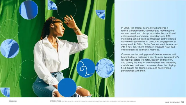
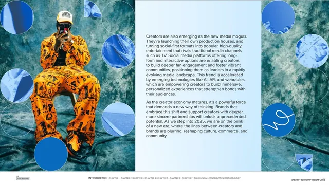
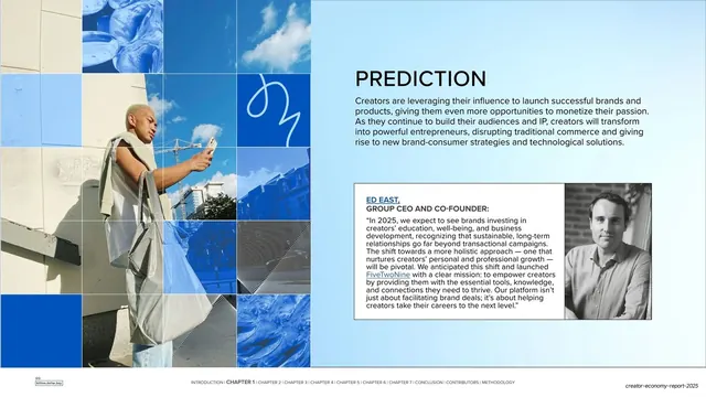
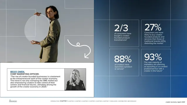
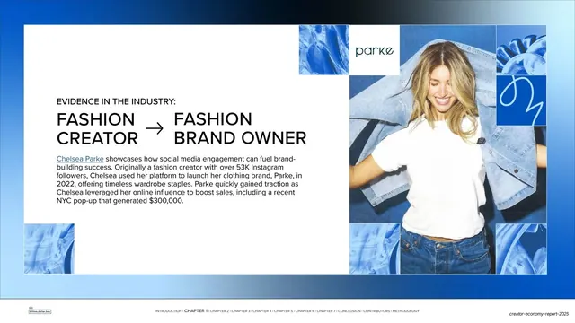
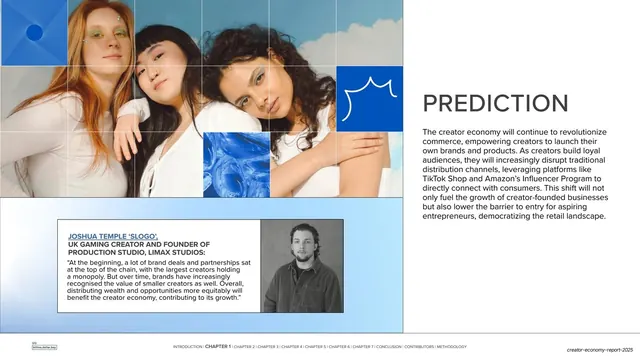
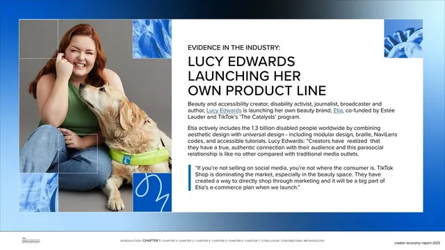
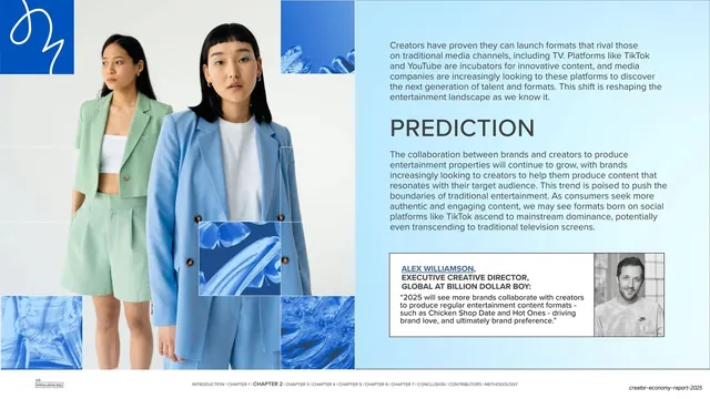
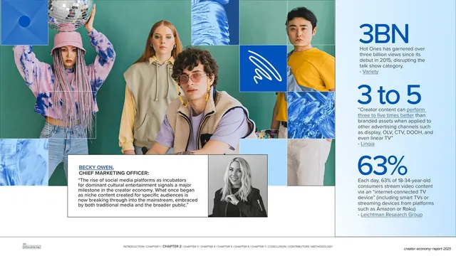
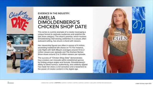
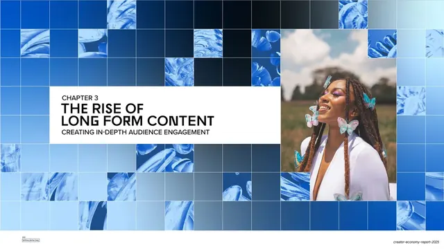
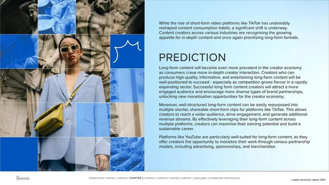
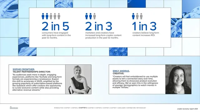
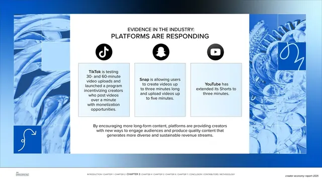
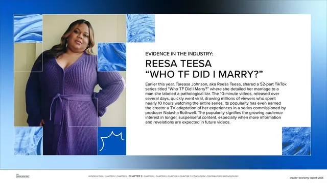
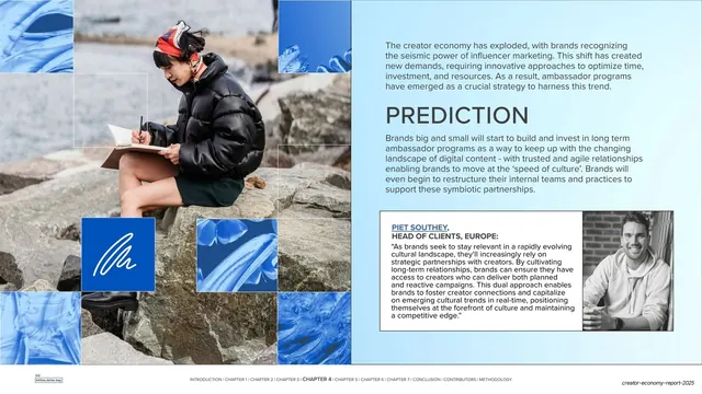
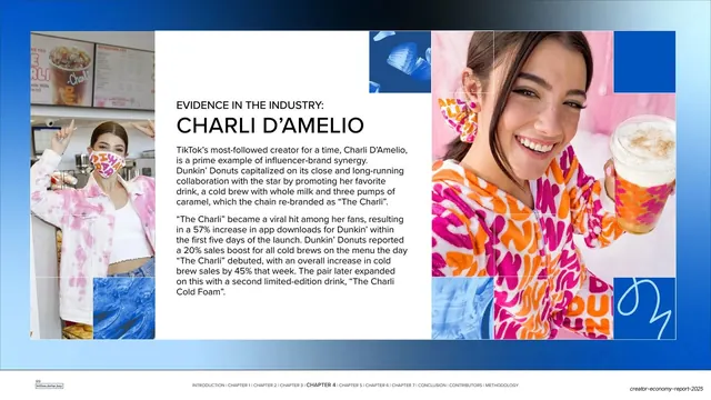
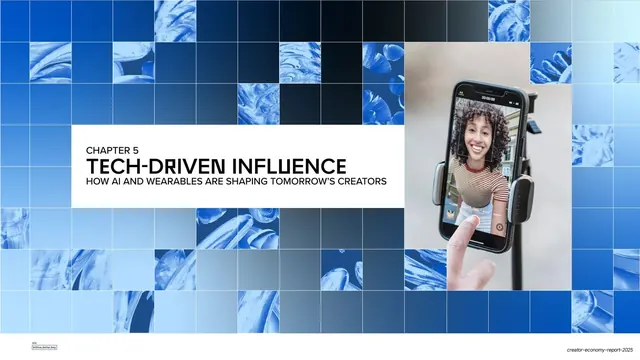
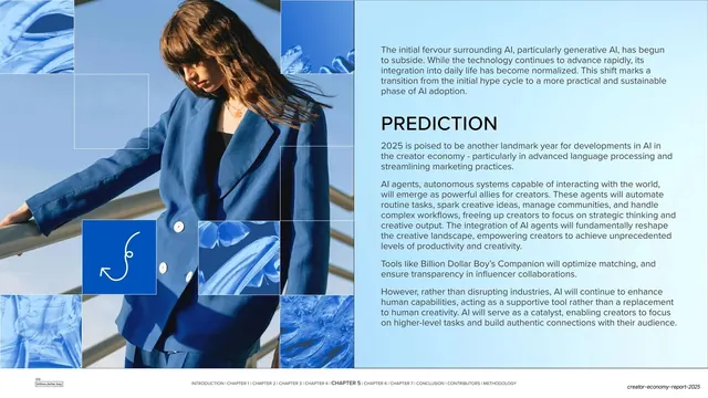
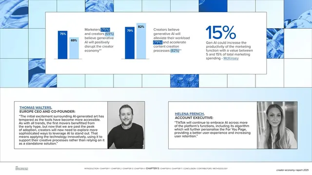
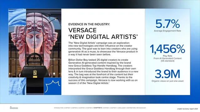
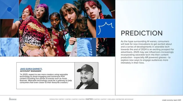
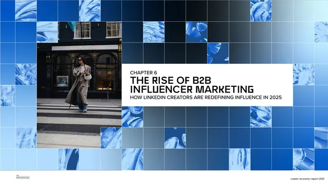
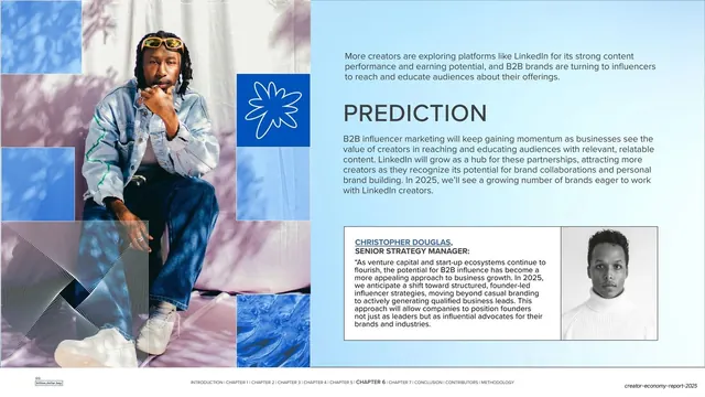
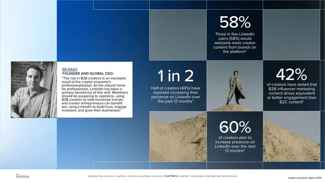
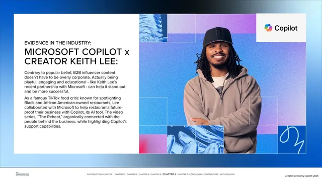
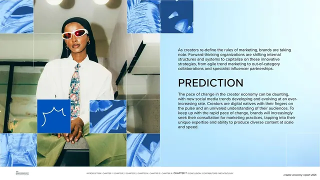
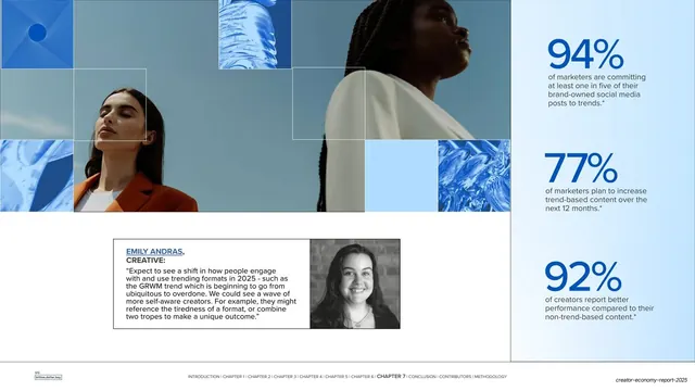
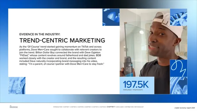
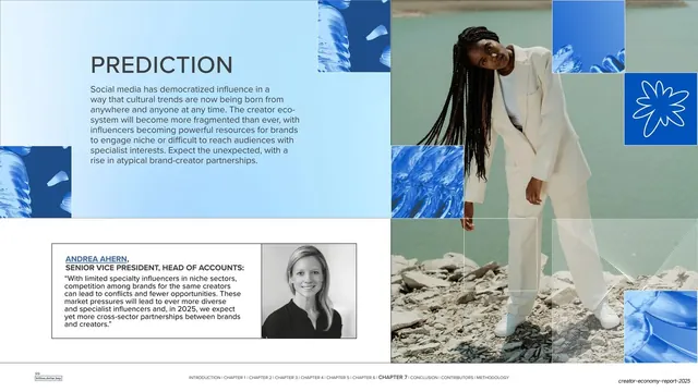
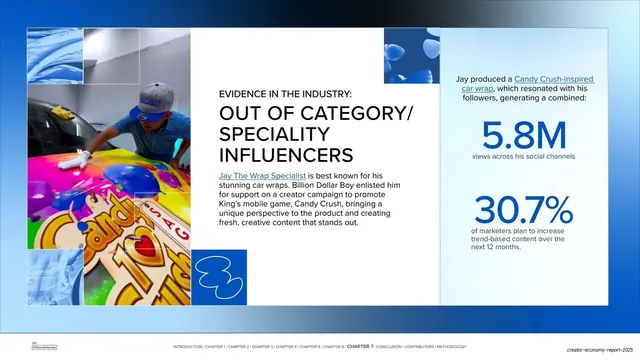
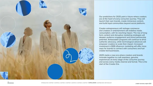
Slides run 16:9. The palette is built almost entirely on cobalt and royal blue (#2156D6 and darker), white, and a pale blue tint, with full-color editorial portrait photography appearing on content spreads. Abstract source imagery (liquid, fabric, and crystalline textures) is desaturated to a blue duotone and tiled into a square grid that fills chapter dividers and frames content; many dividers carry a horizontal dark-to-light gradient band running through the upper third. A small white hand-drawn squiggle or doodle line on a solid blue tile recurs as a brand mark throughout. Type is a bold condensed grotesque set in all caps for headlines (with distinctive angular R and M letterforms), paired with a neutral sans for body copy. The deck cycles through a fixed set of layouts: full-bleed grid chapter dividers with a white label box ("CHAPTER N" plus title and subtitle); "PREDICTION" spreads pairing a large headline and paragraph with a bordered expert-quote card and a black-and-white headshot; "EVIDENCE IN THE INDUSTRY" case-study slides with an oversized two- or three-line all-caps name, body copy, and a color portrait; and statistic slides with very large blue numerals ("3BN", "2/3", "63%", "2 in 5") over short captions. A persistent footer runs a small "billion,dollar,boy" logo at bottom-left and a chapter navigation string (INTRODUCTION / CHAPTER 1-7 / CONCLUSION / CONTRIBUTORS / METHODOLOGY) with the current section bolded.
Key takeaway
The single strongest move is turning abstract textures into a duotone grid system that doubles as both decoration and section structure, so a long report stays visually unified without bespoke art per page. The repeating four-mode rhythm (chapter divider, prediction, evidence, stats) makes 46 slides scannable and gives readers a predictable mental map. The white squiggle on a blue tile is a cheap, memorable brand hook dropped into otherwise rigid grids.
Reuse notes
A strong reference for trends reports, state-of-the-industry decks, and any long data-heavy document that needs to feel editorial and on-brand across 40-plus pages. The fixed-layout system (divider / prediction / evidence / stats) is directly reusable as a report template. The duotone-grid background depends on a single confident accent color; it would read as monotonous without the full-color photography breaking it up, so budget for genuinely good portraits. The chapter-nav footer is a clean wayfinding pattern worth copying for any multi-chapter deck.
From this deck: Billion Dollar Boy Creator Era Report 2025
View deck