Preview image. Unlock full-res
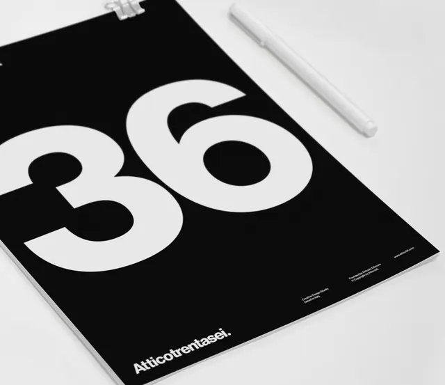
Square monochrome print or zine cover with oversized numerals "36" and "Atticotrentasei" branding on black background.
Summary
A minimalist editorial cover photographed at an angle. Large white numerals "36" dominate a black square background. Small branding text "Atticotrentasei" appears in the bottom corner.
Visual description
Photograph of a square publication cover tilted at a three-quarter angle, shot from above. The cover is pure black with large, clean white sans-serif numerals "36" centered prominently. The scale of the numbers is substantial, occupying most of the visual field. In the lower right corner, small white caps text reads "Atticotrentasei". A white pencil or similar object rests beside the publication, emphasizing the design context. The background is neutral grey. The cover appears to be a high-quality glossy stock or printed material. The composition emphasizes stark simplicity and elegant hierarchy—the number is the sole visual element, with branding subordinate.
Key takeaway
Reducing a cover to its absolute essentials—a single large number, a monochrome palette, and minimal text—creates maximum impact and memorability. The issue number becomes the design itself. This approach works because the audience is expecting editorial design and recognizes the intentionality of the minimalism. The clarity and confidence in the concept make the cover feel premium and authoritative.
Reuse notes
Strong template for design, art, and culture publications. Issue numbers or key data can become the hero graphic on covers. Works best when the publication's audience values restraint and sophistication. The black background creates high contrast and is easier to read than white at smaller sizes. Pairs well with colorful interior spreads or photography to provide breathing room. Requires high-quality printing to justify the simplicity. Use for niche publications or design-focused work rather than mass-market content.
More like this






Keep what you find
A free account saves references to boards and can send you a weekly email of picks based on what you save.
To see every result, go Pro.