Preview image. Unlock full-res
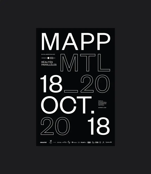
Black and white festival poster featuring large condensed sans-serif typography announcing a mapping exhibition.
Summary
Black and white festival poster featuring large condensed sans-serif typography announcing a mapping exhibition.
Visual description
Black poster on dark background with white typography. The main heading 'MAPP' and subtitle 'REALITÉS PARALLÈLES' are set in large, bold, condensed sans-serif. Dates and details 'MTL 18—20 OCT. 2018' appear in mixed weight fonts, with some letters outlined rather than solid. Sponsor logos appear at the bottom in a horizontal row. Text alignment mixes centered and left-aligned, creating dynamic information hierarchy.
Key takeaway
- Mixing solid and outlined typography creates visual richness without color variation. Oversized condensed type commands attention. Multi-weight typography hierarchy guides reading sequence. Simple two-color approach focuses entirely on typographic contrast.
Reuse notes
Excellent reference for typography-driven poster design. The outlined type technique works particularly well for festival or event posters. Works especially well when printed large. Good model for information-dense design relying purely on type.