Preview image. Unlock full-res
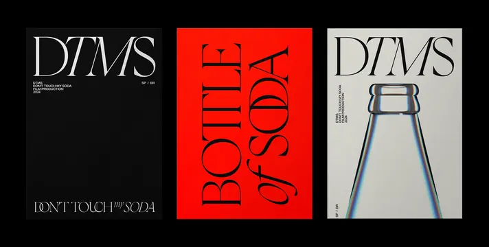
A series of three graphic posters featuring high-contrast typography and minimalist imagery related to 'DTMS' and 'BOTTLE of SODA'.
Summary
A series of three graphic posters featuring high-contrast typography and minimalist imagery related to 'DTMS' and 'BOTTLE of SODA'.
Visual description
The set consists of three vertical layouts: a black poster with white serif text, a red poster with black vertical serif text, and a light grey poster featuring a photographic glass bottle. The typography is large and dominant, utilizing high-contrast serif typefaces across all three compositions.
Key takeaway
Use extreme color contrast and oversized, vertically oriented serif typography to create a strong visual hierarchy.
Reuse notes
Apply this style for high-impact editorial covers, event posters, or brand identity campaigns that require a bold, sophisticated presence.