Preview image. Unlock full-res
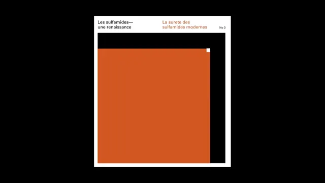
A minimalist publication cover for a book about sulfamides featuring French text, a bold orange color block, and minimal black accents on white background.
Summary
A minimalist book cover design featuring French text at the top and a bold orange rectangular field dominating the composition, with black and white geometric elements and a clean Swiss typography approach.
Visual description
The design is structured with a white background framing a composition on black. At the top, small French typography reads "Les sulfamides, une renaissance" and "La surete des sulfamides modernes No.3" in a mix of sans-serif and serif faces. Below this header is a large, bold orange rectangular field that occupies the majority of the space, with a black rectangular area to its right. A small white square appears as an accent at the top right corner of the orange field. The composition is geometric, balanced, and high-contrast, using only four colors: black, white, orange, and pale cream.
Key takeaway
The power of a single bold color field to create visual impact and memorability. The geometric composition and minimal typography create sophistication. The orange-and-black palette is bold yet professional.
Reuse notes
Excellent reference for book cover design, academic publishing, or professional design systems. The Swiss design principles are timeless. Works well for any publication wanting a modern, authoritative aesthetic. The geometric color blocking is effective and easily reproducible. The mixed typography creates hierarchy without complexity. Could be adapted for journal covers, reports, or any editorial context needing serious, confident design.