Preview image. Unlock full-res
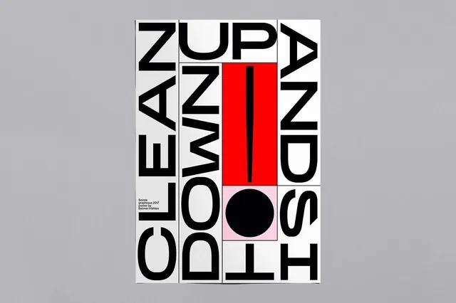
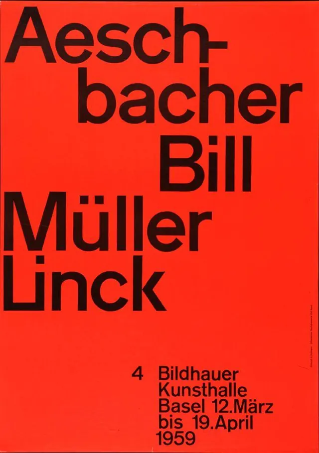
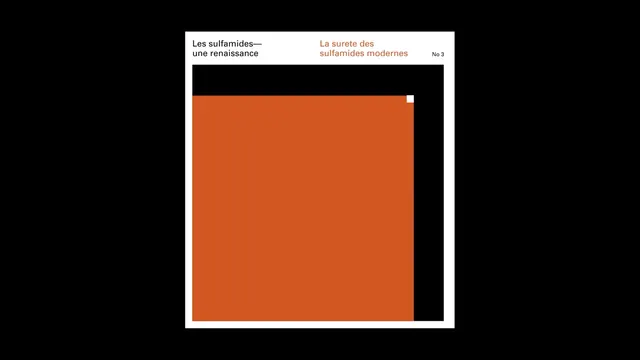
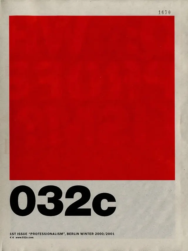
Brutalist magazine cover design featuring a bold red rectangle on aged cream background with minimal black typography below.
Summary
A magazine cover designed as a bold red rectangle dominating aged cream-colored paper, with minimal black sans-serif typography identifying the publication and issue number below.
Visual description
The composition is structured around a single large red rectangle (RGB-like, nearly pure red) occupying most of the upper two-thirds of the cover against an off-white or aged cream background. Below, in the lower third, sits bold black sans-serif text in all capitals: "032C" on one line, possibly with issue information ("1st issue PROFESSIONALISM" and publication details in small print). The typography is carefully kerned and left-aligned. Visible paper texture adds vintage character.
Key takeaway
Extreme color restraint amplifies impact of a single bold geometric shape. Brutalist hierarchy achieved through scale, color contrast, and whitespace rather than decoration.
Reuse notes
Strong reference for editorial design, high-impact print campaigns, and any project needing bold simplicity with a premium feel. Works across print, packaging, and digital interfaces that benefit from architectural restraint.