Preview image. Unlock full-res
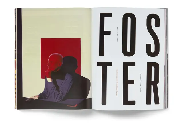
A landscape editorial design featuring striking contrast between deep burgundy and light cream tones from Rapha Mondial magazine.
Summary
A landscape editorial design featuring striking contrast between deep burgundy and light cream tones from Rapha Mondial magazine.
Visual description
Magazine spread layout with sophisticated high-contrast design. Deep burgundy-brown (almost maroon) pairs with cream-white in a bold typographic or layout composition. The extreme contrast between the two colors creates visual drama while maintaining elegance. Serif typography likely complements the luxury editorial context. The landscape format suggests a two-page spread.
Key takeaway
High-contrast editorial design using sophisticated color pairing (burgundy-cream) creates visual impact while maintaining editorial sophistication. The restraint to just two colors demonstrates confident design thinking.
Reuse notes
Reference for editorial or luxury brand work. The burgundy-cream combination conveys premium positioning. Works well for magazine spreads, annual reports, or formal editorial contexts. Best used with serif typography for maximum elegance.
More like this
Keep what you find
A free account saves references to boards and can send you a weekly email of picks based on what you save.
To see every result, go Pro.