Preview image. Unlock full-res
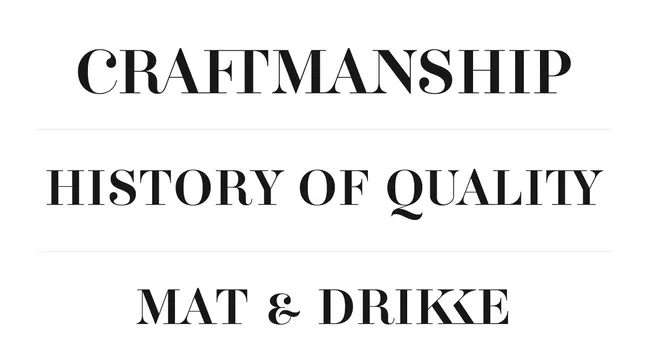
Minimal text-only poster using large serif typeface centered on white background with horizontal dividing lines.
Summary
A stark text-driven poster using elegant serif typography to present three phrases—"CRAFTMANSHIP," "HISTORY OF QUALITY," and "MAT & DRIKKE"—separated by thin horizontal lines on a white ground.
Visual description
Three stacked lines of large serif type in dark charcoal/black, each phrase separated from the next by a thin horizontal rule. The typeface is traditional, with marked serifs and generous letter spacing. Layout is centered and vertically symmetrical. White space dominates; text occupies roughly the middle third of the composition. The overall effect is calm, orderly, and typographically confident.
Key takeaway
The restraint—using type alone, with no imagery or color accent—amplifies typographic authority. The classic serif font signals heritage and quality; the symmetrical hierarchy makes every phrase equally legible despite reading order. An effective approach for brands communicating core values or brand pillars.
Reuse notes
Excellent default for minimalist brand statements, core-value declarations, or heritage/quality positioning. Works best with serif fonts that have strong character and generous x-height. The centered, vertical composition feels formal; suits luxury, artisan, or established-brand contexts. The monochrome execution requires confident typography; weak fonts or awkward spacing will show immediately.