Preview image. Unlock full-res
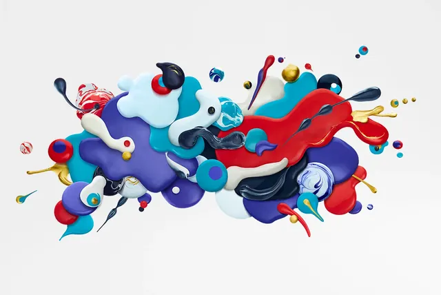
A dynamic, multi-colored 3D abstract composition featuring various fluid, organic shapes and droplets floating against a plain light background.
Summary
A dynamic, multi-colored 3D abstract composition featuring various fluid, organic shapes and droplets floating against a plain light background.
Visual description
The composition consists of overlapping, glossy 3D blobs and droplets in vibrant shades of blue, red, white, and black. These organic forms are arranged in a central, sprawling cluster with smaller droplets scattered around the periphery. The lighting creates soft highlights and shadows, giving the shapes a tactile, liquid-like appearance.
Key takeaway
Use high-gloss, organic 3D shapes with high color contrast to create a sense of movement and depth.
Reuse notes
Ideal for hero sections on creative agency websites, packaging backgrounds, or digital art backgrounds.
More like this



Keep what you find
A free account saves references to boards and can send you a weekly email of picks based on what you save.
To see every result, go Pro.