Preview image. Unlock full-res
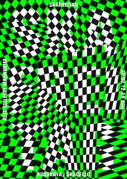
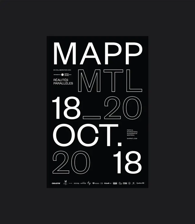
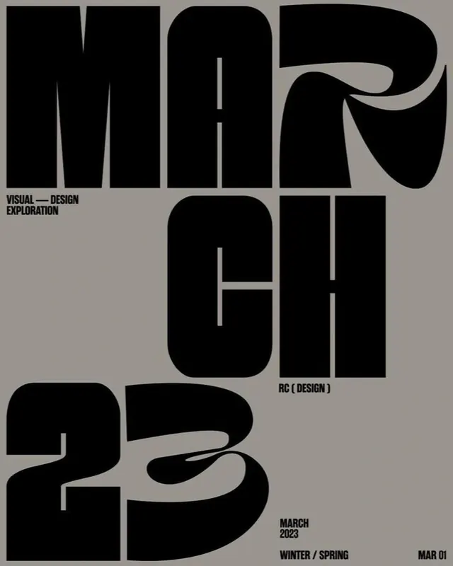
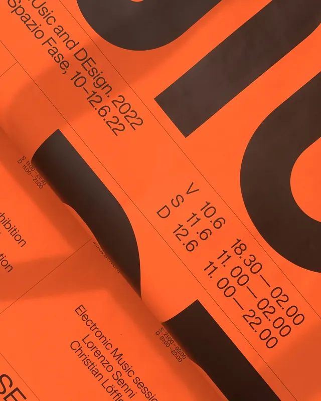
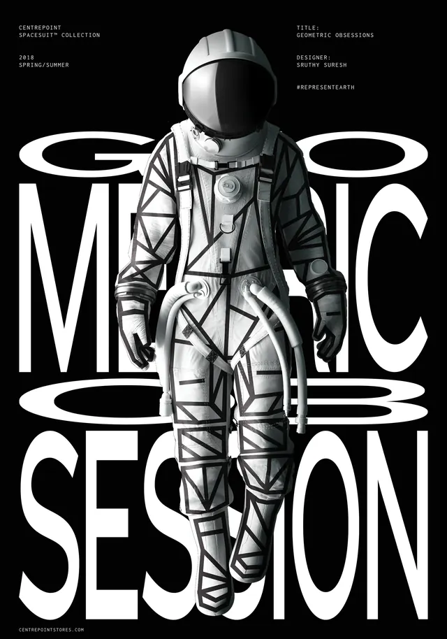
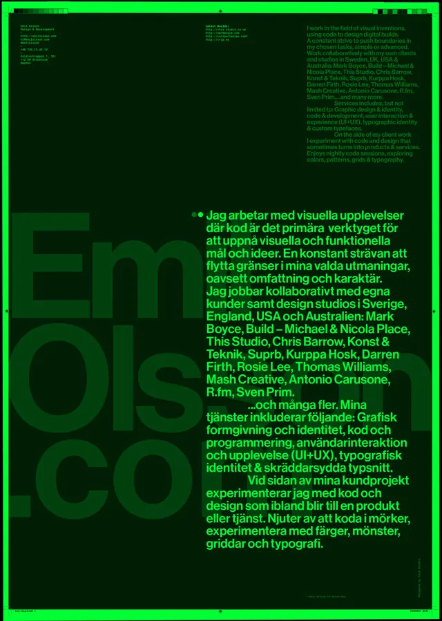
A poster design combining bold typography with strict geometric grid layout, emphasizing hierarchy and visual rhythm through text placement.
Summary
A Swiss-style typographic poster that uses strict geometric layout and bold sans-serif letterforms to create clear information hierarchy and visual drama without imagery.
Visual description
The composition employs a rigid modular grid. Bold, dark sans-serif type sits at various positions and sizes across the layout, with generous negative space framing each text block. The type is typically condensed or compressed, allowing for large letterforms in a relatively compact space. Color is usually monochrome or near-monochrome (black and white, possibly with one accent color). The overall effect is orderly, professional, and commanding.
Key takeaway
Typography itself can be the primary design element. The discipline of grid-based layout combined with varying type sizes and weights creates visual interest and guides the eye without relying on images, color, or ornament.
Reuse notes
Applicable to event posters, wayfinding systems, book covers, or conceptual design work. The Swiss approach is timeless for technical and professional contexts. Study the grid proportions and type size relationships. The high-contrast monochrome approach is economical for print production.