Preview image. Unlock full-res
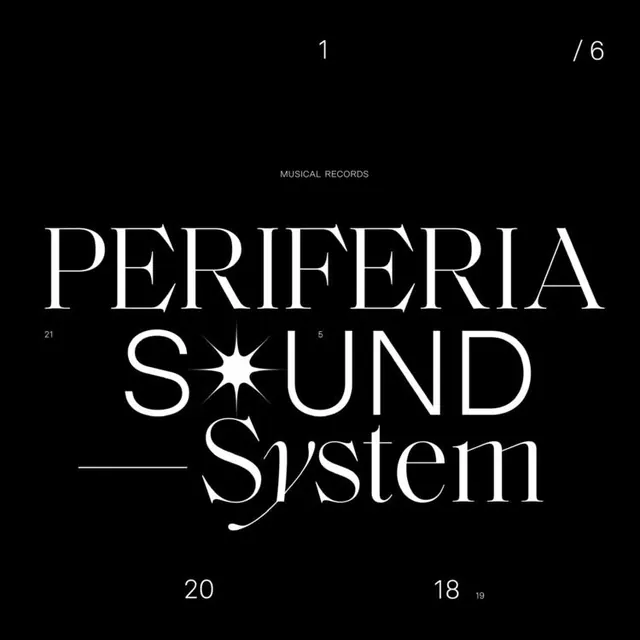
Minimalist music record sleeve with geometric serif typography, page numbers, and metadata arranged across a pure black background.
Summary
A Swiss modernist record sleeve design featuring centered white serif typography spelling "PERIFERIA SOUND System" with small page numbers and metadata scattered across a black background.
Visual description
Pure black background with white typography arranged vertically and horizontally. Centered in the layout is the word "PERIFERIA" in large geometric serifs, with a small star-burst icon replacing one character (the "O" in SOUND becomes a star). Below is "SOUND" in the same typeface, then "System" in a lighter weight serif. Scattered around the composition are small numbers (1, 5, 20, 18, 19, 21) and page indicators (1/6 in the top right). At the very top, small caps read "MUSICAL RECORDS." The overall effect is archive-like, technical, and precise.
Key takeaway
How numeric and textual metadata becomes design, not just information. The star-burst detail humanizes what would otherwise be purely mechanical typography. The scattered numbering creates rhythm and visual interest while suggesting a curated, deliberate structure. Black and white create maximum legibility and timelessness.
Reuse notes
Ideal for music releases, archives, and design-forward branding. The Swiss modernist approach works well for any brand seeking technical credibility and premium positioning. The metadata-as-design approach is particularly effective for multi-part releases, collections, or anything numbering/pagination. Works exceptionally well for vinyl sleeves, digital album art, and gallery/museum catalogs. The high contrast reads well at very small and very large scales.